On this page
Ultimate guide to CRM charts: techniques for data management
Sorting through disorganized contact records or deal notes makes it hard for sales reps to know what to do next and can slow down momentum.
CRM charts bring order to your sales data, giving you a clear, visual snapshot of what’s moving, what’s stalling and where your team should focus its efforts.
In this guide, you’ll learn the different types of CRM charts and how to use them to get actionable insights that keep sales progressing.
Key takeaways from CRM charts
CRM charts visualize sales pipeline data, KPIs and customer activity so teams can spot trends and act quickly.
Different chart types serve different purposes: funnel charts track pipeline conversion, line charts show trends over time and bar charts compare performance across reps or products.
CRM charts drive decisions when they become part of your team’s weekly pipeline reviews and daily dashboard checks.
Build and customize your own CRM dashboards with Pipedrive Insights – try it free for 14 days.
.
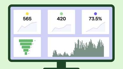
What are CRM charts?
CRM charts are visual representations of your customer and sales data, built directly inside your customer relationship management (CRM) platform.
These tools translate raw records such as deals, activities and revenue into formats such as graphs, bar charts, pie charts, funnel charts, area charts or multi-series charts. The goal is to surface patterns that would take hours to find manually.
Visual charts make it easier to monitor key performance indicators (KPIs) and other metrics, including:
Revenue analysis
Customer satisfaction scores
Deal success rates
Improved visibility enables businesses to refine sales strategies and drive more revenue.
Example: A SaaS account executive manages 40 open deals. Without charts, spotting which deals are stalling means opening each record individually.
With a funnel chart on their CRM dashboard, they can see at a glance that 15 deals have been in the “demo scheduled” stage for more than two weeks. The chart provides a clear signal for follow-up and keeps every deal on the account executive’s radar.
Personal vs system charts
CRM charts fall into two categories depending on who can see them.
Personal charts are created and viewed by the individual who built them. Personal charts are useful for tracking your own pipeline, activity quota or commission progress without affecting the views other team members see.
System charts are visible to everyone with the right permissions. System charts provide a consistent view across the team. This chart type is useful for pipeline reviews, forecasting calls and sales meetings.
Most CRM setups benefit from both: personal charts for individual accountability and system charts for shared performance reviews.
Key KPIs to track (and which CRM charts to use for each)
To choose the best KPIs for your charts, you need to know what you want to improve.
Start with these common scenarios:
If deals are taking too long to close, track sales cycle length and pipeline stage conversion rate
If your forecast keeps missing, track the pipeline value and average deal value
If you’re not sure where reps are spending their time, track activity per rep and deal progression
If customers are leaving after they sign, track customer satisfaction score (CSAT) and churn rate
Once you know which KPIs to track, pair each one with the chart type that makes the data easiest to read.
The table below shows which format works best and why:
KPI | Chart type |
Deal conversion rate | Funnel chart, because it shows exactly where leads drop off at each stage |
Sales cycle length | Line chart, because it reveals whether closing times are speeding up or slowing down over time |
Pipeline value | Bar chart, because it compares values across stages or reps side by side |
Average deal value | Bar chart, because it makes high and low performers easy to spot at a glance |
Win/loss ratio | Comparison chart, because it puts won and lost deals directly next to each other |
Activity per rep | Bar chart, because it instantly shows who is active and who needs coaching |
Revenue vs. target | Bar chart, because a target line makes the gap between actual and goal visible |
Customer satisfaction score (CSAT) | A line chart, because it tracks whether satisfaction is trending up or down over time |
For most SMB sales teams, five to seven KPIs is ideal.
This number is manageable enough that every metric can get attention in a weekly review, preventing important signals from getting lost in a wall of charts.

How CRM charts fit into your sales process
CRM charts are most useful when your team checks them as part of a routine to inform and streamline its sales strategy.
For most sales teams, that means building charts into two workflows: the weekly pipeline review and the individual rep’s daily dashboard check.
Weekly pipeline review
A pipeline review is the moment your team uses chart data to make decisions such as which deals need attention, where the bottleneck is and whether the forecast is on track.
A funnel chart showing stage-by-stage conversion and a bar chart comparing deal value by rep give a manager everything they need to run that conversation in under 15 minutes.
Daily dashboard check
Individual reps benefit from a personal dashboard that shows their open deals, upcoming activities and progress against targets.
Checking the dashboard at the start of each day keeps their pipeline moving without relying on a manager to flag what needs attention.
Connecting charts to automation
Most CRM systems let you set up automated alerts based on the data your charts are already tracking.
In Pipedrive, for example, you can trigger a workflow automation when a deal sits in a stage for more than a set number of days, which would then be reflected in your funnel chart.
Combining charts with automation means your team gets a visual overview and a direct prompt to act.
Note: Marketing teams can also use CRM charts to track the performance of marketing campaigns and customer engagement alongside sales data.
For example, a bar chart comparing lead volume by campaign source helps a SaaS company see which campaigns are filling the pipeline and which aren’t worth the spend.
3 types of tools you can use to create CRM charts
Most businesses build CRM charts using one of three approaches: their CRM software’s built-in reporting, a dedicated BI tool or a spreadsheet.
Here’s how they compare.
1. Built-in CRM reporting
Native charting tools pull directly from your CRM data with no exports or setup required.

Pipedrive Insights, for example, lets you build and share charts from your live pipeline data in a few clicks.
Pros
Charts update automatically as new CRM data comes in, giving your team a real-time view without any manual effort
The interface is designed for sales teams rather than data analysts, making it the most user-friendly option for most SMBs
Most built-in CRM data reporting tools include ready-made report templates, so you can get your first charts up and running without building from scratch
You don’t need to do any manual data imports or dataset preparation
Cons
Reporting is limited to the customer data inside your CRM, so cross-platform analysis isn’t possible without integration with another tool
2. Dedicated BI tools
Tools like Power BI connect to your CRM and let you build customizable charts across multiple data sources.

These solutions are useful when you need to aggregate CRM data alongside finance systems, marketing tools or product analytics.
Pros
Charts and data visualization options are highly customizable beyond what most CRM tools offer natively
You can combine CRM data with data from other platforms for cross-functional reporting
These tools are better suited to complex reporting needs that span multiple datasets
Cons
Setup takes longer, and the learning curve is steeper than built-in CRM reporting
Maintaining dashboards usually requires a dedicated analyst
3. Spreadsheets
Excel and Google Sheets are common options for teams that export CRM data and manually build charts.
Here’s an example of a CRM dashboard in Excel from Smartsheet:

Most CRM platforms let you export report data as an XLSX or CSV file for this purpose.
Pros
Spreadsheets are flexible and familiar to most users, with no additional software cost
Most CRM platforms support XLSX and CSV exports, making it easy to get your data into a spreadsheet quickly
Cons
Charts built in a spreadsheet don’t reflect real-time changes in your CRM
Keeping data accurate requires manual updates every time something changes in your pipeline
For most SMB sales teams, built-in CRM reporting has all the functionality they need. BI tools can make sense when your reporting needs outgrow what your CRM can handle natively, while spreadsheets are a fit for users with very light CRM charting needs.
Best practices for chart design
A well-designed CRM chart gives your team the clarity to act on data without having to work too hard to understand it.
Here are some design principles to follow when creating your charts:
Remove visual noise. Excessive labels, too many color segments and cluttered legends slow comprehension. Every element should earn its place.
Label axes clearly. Always include units, for example, “$USD” or “%”, and give each chart a descriptive title that states what it shows. Sales teams reviewing real-time data in a dashboard shouldn’t have to guess what a number represents.
Highlight what matters. Use contrasting colors or callouts to highlight data points that require action, such as a pipeline stage with an unusually high drop-off rate or a rep whose activity has dropped week on week.
Design for accessibility. Avoid relying on color alone to distinguish data. Use patterns, labels or shapes alongside color so charts stay readable for everyone on the team.
Give every chart context. A chart showing a 20% drop in customer satisfaction scores means nothing without the surrounding context. Add a short description or use the chart title to explain why the data matters and what action it should trigger.
Following these guidelines ensures that your charts convey information effectively and in a user-friendly way.
How to build CRM charts in Pipedrive Insights
In Pipedrive’s Insights feature, CRM charts live inside reports.
When you create a report, you choose a chart type to display the data. A dashboard is a collection of reports displayed in a single view.
Here’s how it works in practice.
1. Create a report
Click “+ Create” > Report and select your report type.

The reports available depend on your plan, but all plans include deal performance, deal conversion, deal progress and activities performance as a starting point.
2. Select your chart type
Pipedrive has five chart types to choose from: column, bar, pie, table and scorecard, which you’ll find below.

Not every chart type works with every report. Deal performance reports support all five, while deal conversion reports only offer column charts.
3. Configure your data
Column and bar charts give you three fields for organizing your data:
Measure-by (Y-axis). The metric you want to track, such as deal value or number of activities.
View-by (X-axis). How you want to break the data down, such as by stage, owner or time period.
Segment-by (optional). A secondary grouping, like pipeline or deal source.
Pie charts use measure-by and segment-by only.

The scorecard chart uses just measure-by, showing a single headline metric with a small indicator displaying movement since the last period.
4. Add your chart to a dashboard
After saving a report, add it to a dashboard by clicking “Add to dashboard.”
Each chart appears as a widget that you can resize and reorder within the dashboard view.
You can display the same report on multiple dashboards, or drag reports directly from the reports panel into any dashboard.

You can share dashboards with other Pipedrive users or send external stakeholders a public link with view-only access.
Sales Pipeline Course
Final thoughts
Understanding which CRM charts to use and how to build them turns your sales data from a record of what happened into a guide for what to do next.
Start with the KPIs that reflect your biggest challenge right now and create charts that your team checks every week.
With Pipedrive Insights, you can build and share those charts in minutes. Try Pipedrive free for 14 days and turn your sales pipeline data into actionable insights.


