Pipedrive’s new activities performance insights enable you to keep track of your team’s progress, spot when a colleague needs help and plan ahead for the activities that need to be completed.
Get an insight into how your team is progressing with their sales activities with the new activities performance dashboard.
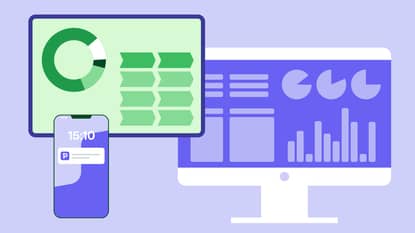
Located in the Insights section of Pipedrive, this feature enables you to create, adjust, view and share visual representations of your team’s sales performance.
You can view activities on a daily, weekly, monthly, quarterly or yearly basis, or even set your own timescale. Here are just a few examples of what you can use activities performance insights to see:
- How many activities were completed last week
- How many activities were added last month
- What activities are planned for this week
- From all activities planned for this week, how many were completed?
- How many hours of a certain activity have been done this month
Use filters to view the metrics you want to see
To view progress on any different activity you just have to add filters. Here are some examples of the filters available, which are all color-coded to make it easier to view your data:
- Team
- User type: Whether the person created the activity, it was assigned to them or they are the contact
- Organization
- Activity type: Phone call, follow-up email, meeting and more
- Status: Done or to do
- Date type: The time the activity was added, it’s due date, the last notification time, when it was updated or marked as done
There are also two ways you can filter the tasks data to choose how you view your results:
- Number of activities: how many tasks were done or are ‘to do’
- Duration: How many hours of tasks were done or how many hours of the tasks are scheduled
Create charts to help you understand the data
You can choose the chart type that you prefer to visualize the data, whether it’s a column chart, bar chart, pie chart, scorecard or table.
Once you’re happy, you can save it, add it to a dashboard and share it with your colleagues. You can even save as new if you want to keep the original chart as it was and compare it to the new one.
Here are some of the many potential ways you can use activities performance insights:
- See who in your team completed the most activities in a month, with a breakdown for each person of the activities they completed, to find your most active reps
- Get an overview of planned activities for the week and then track how much of the planned work is completed
- View all the meetings last quarter and then toggle by duration and number to better understand how your reps behave with prospects
Dashboards don’t just have to be all activity charts or all performance charts. Mix and match your metrics to get a more complete picture of how your activities impact your sales.
The chart in the first bullet above, for instance, could be added to a chart with most revenue made in a month, so that you can better judge which activities have the biggest impact and which reps are the most efficient.
Activities performance insights is available to all our users across our four pricing plans. You can find out more in our Knowledge Base article.
This article was published on August 10,2020. Product descriptions were correct at the time of publishing.