Your brand identity does the heavy lifting regarding customer recognition and trust. Get it right, and people will remember your business and return when they’re ready to buy.
Building a brand identity takes some planning, but it’s one of the best investments you can make to ensure people will recognize your brand.
This guide provides nine practical steps for creating a brand identity that connects with your target audience and supports your business goals.
What is brand identity?
Your brand identity is everything that makes your business recognizable. It includes visuals (like your logo and colors) and how you communicate with customers.
When brand identity elements work together, they create a clear picture of what your business stands for. Customers know what to expect, and your team knows how to represent your company.
Take Red Bull, for example. The company built a memorable brand around high-energy advertising and sponsorship of extreme sports.

Every piece of marketing reinforces the idea that Red Bull “gives you wings”, fuelling adventure. When you see a Formula 1 car or a skydiving video, you expect to see Red Bull’s logo.
For small businesses and startups, a great brand identity builds trust with potential customers. Every touchpoint reinforces who you are and why customers should choose you.
Some companies go bold and playful, while others choose serious and professional. The key is making sure all of the pieces fit together and reflect what your business is really about.

How to create a brand identity that drives engagement
Developing a brand identity helps you build the customer relationships necessary for growth. It provides a clear framework for your customer service, marketing and sales.
Here’s a nine-step brand identity development process for your small business.
1. Define your brand’s core personality and values
Before you pick colors or design logos, you need to know what your brand stands for and how it should feel to customers.
Your brand’s values are the foundation of your identity. They guide every decision, from the products you sell to how you interact with customers.
Patagonia is a solid example of a good brand with strong values. It built its brand around the mission “We’re in business to save our home planet”.

The company’s personality is rugged and rebellious, encouraging customers to buy less and repair their gear.
Start defining values by answering a few core questions about your business:
Brand identity questions | What to consider |
What is your purpose? | Look beyond profit. What problem do you solve for your customers? What positive change does your business create? |
What are your core values? | List three or so guiding principles for your company. Examples include a commitment to green growth or technical innovation. |
What is your personality? | How do you want customers to feel about your business? Imagine your brand as a person at a networking event. How would they talk to people? What would they care about? |
A useful way to categorize your brand’s personality is with Aaker’s “Five Dimensions” framework:
Sincerity: down-to-earth, honest and cheerful
Excitement: daring, imaginative and modern
Competence: reliable, intelligent and successful
Sophistication: upper-class, charming and luxurious
Ruggedness: outdoorsy, tough and resilient
For example, a new accounting firm might use a mix of competence (to build trust) and sincerity (to feel approachable). Its choice informs future branding decisions, steering them toward a design that looks both professional and welcoming.
Write down your answers to these questions. You’ll reference them during the next steps and when making future decisions.

2. Research your target audience’s visual preferences
Once you know your brand’s personality, you must understand what appeals to the people you want to reach.
When your visual identity matches your audience’s expectations, you’ll see stronger engagement and higher conversion rates. Mismatched branding can make potential customers uncertain about your business, causing them to look elsewhere.
Start by gathering basic information about your target customer personas. If you’re just starting out, look at your current customer base or research your ideal customer profile.
Here are the main areas to research:
Brand building research area | What to look for |
Age, location, income level, job roles | |
Visual elements | Colors, styles and designs they respond to |
Brand interactions | Which companies they follow and buy from |
Communication style | Formal vs. casual, technical vs. minimalist |
To gather this information:
Survey customers about their preferences
Check which brands your audience follows on social media
Use tools like Google Analytics to see your website visitors’ demographics
Finally, review the websites and marketing efforts of other businesses in your field. Note the colors, logos and overall tone they use.
Analyze your competitors and look for opportunities to differentiate your business. A more friendly approach could help you stand out if they all use a corporate style.
Note: Try collecting ideas on a mood board. Gather color schemes and designs that align with the aesthetic of your target audience. Reviewing this collection will reveal themes and give you a clear direction for your style.
3. Choose your brand colors using psychology principles
Colors trigger emotional responses and influence how people see your business. Understanding psychology helps you pick shades that support your brand personality and appeal to your target audience.
For some companies, color becomes a crucial part of their brand image. Take Tiffany & Co., which has used its signature “Tiffany Blue” since 1845.

The robin’s egg blue appears on everything from store interiors to jewelry boxes, creating an emotional connection and driving brand loyalty.
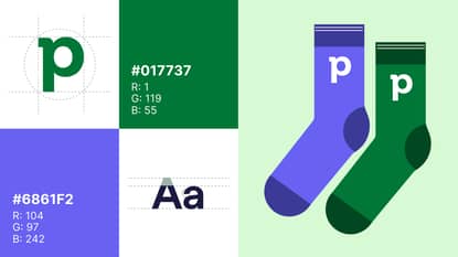
Pipedrive uses this same strategic thinking with its color choices. Its vibrant green reflects the company’s goal of driving growth for small businesses.

It balances this with pops of purple to create an energetic yet professional feel.
The right color palette can make customers feel more confident buying from you. Marketing studies frequently show how people associate certain colors with specific emotions.
Here are some common color associations to consider, according to a recent review of the research:
Color (emotions and associations) | Where it works best |
Blue (trust, reliability, professionalism) | Financial services, healthcare, tech (e.g., PayPal) |
Red (energy, urgency, excitement) | Food, entertainment, sales (e.g., Coca-Cola) |
Green (growth, nature, money) | Environmental, financial, health brands (e.g., Whole Foods) |
Orange (creativity, enthusiasm, affordability) | Creative services, children’s products (e.g., Nickelodeon) |
Purple (luxury, creativity, wisdom) | Beauty, premium products (e.g., L’Oréal) |
Black (sophistication, power, elegance) | Luxury goods, professional services (e.g., Uber) |
Yellow (optimism, happiness, attention) | Food, children’s products, warnings (e.g., McDonald’s) |
To build a balanced palette, use the 60-30-10 rule:
Use your primary color 60% of the time. The color that best represents your brand’s core personality.
Use your secondary color 30% of the time. This one should support your primary color and provide contrast.
Use an accent color 10% of the time. Use this shade sparingly for essential elements like call-to-action buttons.
When you’ve settled on a palette, run a focus group, show the colors to your target audience and ask what comes to mind. Their responses will tell you if your colors send the right message.
Colors can look different on screens versus printed materials. Always test your colors across the platforms where your audience sees your brand most often.
4. Design a memorable logo that tells your story
Your logo is often the first thing people notice about your brand, but a strong design doesn’t have to be complex or expensive. Simple logos work better because they’re easier to recognize.
Zoom’s logo design shows how effective basic visual branding can be:

It’s just a simple camera icon, yet it became instantly recognizable during the remote work boom.
The most common types of logos include:
Logo types | What it is (with examples) |
Wordmark | A logo that uses the brand name in a stylized font. Works well for businesses with a catchy, unique name. Examples: Google, Coca-Cola |
Lettermark | A logo using the company’s initials. A good option for businesses with long names that are catchier as an abbreviation. Examples: IBM, HBO |
Combination mark | A logo that pairs a symbol with a wordmark. A versatile and flexible choice for companies that want to use both types of logos. Examples: Pipedrive, Adidas |
Emblem | A logo with the company name inside a shape. Can have a more traditional, established feel. Examples: Starbucks, Harley-Davidson |
A high-quality logo should:
Work in black and white (not just color)
Look clear when small (like a social media profile picture)
Work in different sizes for different types of marketing content
Reflect your brand personality and leave a lasting impression
Stand out from competitor logos
Be easy to reproduce both digitally and physically
Be visible on different colored backgrounds
If the budget is tight, start with simple text-based logos using clean fonts. Tools like Canva can help you create something professional-looking for free. As your business grows, consider investing in a graphic designer.
Skip trends that might look dated in a few years. Instead, focus on timeless design principles rather than popular ones to avoid rebranding early.
Finally, save your final logo in multiple formats (PNG, JPG, SVG) so you can use it everywhere from business cards to billboards.
Free ebook: How to tell your brand story
5. Select typography that matches your brand voice
The fonts you use help define your brand’s voice. Good typography makes your written material more readable and adds personality to your communications.
Spotify shows how typography reinforces its voice. It uses a custom font called “Spotify Circular” with rounded letters that feel modern and accessible.

This typeface matches their personality as a platform that makes music discovery easy and enjoyable.
You’ll need two fonts: one for headlines and another for body text. Your primary font should be distinctive, while your secondary font keeps text clean and easy to read.
For example, pair a serif or sans-serif font with a script one. Here’s how they differ:
Serif fonts like Times New Roman have small decorative lines on the letters. They’re more traditional and authoritative.
Sans-serif fonts like Arial lack these lines. They look modern and are very easy to read on screens, making them the best for email.
Script fonts like Pacifico imitate digital handwriting. They’re elegant and personal, but better for accents because they’re less legible.
When choosing fonts, make sure they’re readable at small sizes (12 pt and smaller), readily available on different platforms and devices and work well in digital and print formats.
Google Fonts offers hundreds of free options. Two popular combinations are Montserrat (headlines) with Open Sans (body text) or Playfair Display (headlines) with Source Sans Pro (body text).

6. Develop your brand voice and messaging framework
Your brand voice is how your business sounds when it communicates. It should feel consistent whether someone reads your website, social media posts or sales emails.
Consider the difference between how a bank talks to customers and how a coffee shop does. The bank uses formal language, while the coffee shop uses casual terms that make customers feel welcome.
Both approaches work, but they serve different brand personalities.
To create a consistent brand voice, you need a strong messaging framework to guide you. It’ll define the key points you want to communicate and how you do it, so your brand always sounds the same.
For example, Pipedrive built its brand around the idea that it’s “a tool created by salespeople, for salespeople”. This concept guides everything from product development to marketing, ensuring every customer interaction reinforces its expertise in sales.
Here are some messaging takeaways to consider (with examples from Nike):
Essential messaging elements | How they work |
What makes your business different and valuable. Example: Nike inspires athletes to push their limits through innovative sports products | |
Tagline | A short, memorable phrase that captures the essence of your company and drives brand recognition. Example: Nike’s “Just Do It” |
Key benefits and talking points | Three to five main pain points you solve for customers. Example: Nike offers performance enhancement, motivation and athletic style |
Proof points | Facts, features or credentials that support your claims. Example: Top athletes endorse Nike and it advertises proprietary tech like Air Max cushioning |
Why your business exists and what drives you. Example: A coach and runner founded Nike to help athletes perform better |
Once you’ve defined these elements, draft responses to common customer questions using your brand voice. It’ll give your team examples to follow when talking to prospects.
Write down specific words and phrases your brand will use or avoid. For instance, you might use “affordable pricing” instead of “cheap” to position your product as valuable rather than low-quality.
With a clear outline, you ensure everyone in your company talks about the brand similarly.

7. Create brand guidelines that your team can use
Brand guidelines explain how to use your branding. They’re a document that keeps your brand representation consistent as your business grows and you create more content.
Your guidelines should answer the questions after establishing a brand identity, like when someone creates marketing materials.
For example, Pipedrive uses a detailed style guide to ensure consistent branding. It uses simple phrases like “easily manage leads and deals” to showcase how its CRM provides key features that sales teams need.

Its action-oriented messaging reflects the brand’s commitment to empowering sales teams.
Start building your brand guidelines with a short deck slide, like this example from OntraPort:

It’ll be more practical and easier to use than a long document. Make sure to include everything you’ve created up to this point:
Brand guideline elements | What to include |
Logo usage | Show your primary logo and alternative versions. Provide clear rules for using it (e.g., don’t stretch or re-color). |
Color palette | List your primary, secondary and accent colors. Include the specific digital (HEX) and print (CMYK) codes. |
Typography | Show your fonts. Explain when to use each and provide an example of text hierarchy (e.g., Heading 1, Heading 2, paragraph). |
Brand voice examples | Include a summary of your brand voice and key messaging points for easy reference. Show actual email responses and social posts. |
Design elements | Provide examples of imagery, icons and photography you’ll use (or have already used). |
It’s also a good idea to include a “what not to do” section with examples of incorrect usage. Explicit visual references help your team avoid off-brand messaging.
Create your guidelines in an easily shareable format, such as a PDF or Google Docs, and store them somewhere your team can always access the latest version.
Introduce the document to key team members and make the guidelines part of your onboarding process for new hires and freelancers.
Treat these guidelines like a living document. Update them regularly as your brand evolves from an unknown startup to a recognizable company.

8. Apply your new brand identity across all touchpoints
Now that you have your brand identity design, use it everywhere customers encounter your business.
Consistency across the customer journey helps them recognize you immediately, whether they visit your website or receive a package from you.
Start with the touchpoints your customers see most often. If you do most of your business online, prioritize your website and social media profiles. If you meet customers in person regularly, focus on business cards and printed materials first.
Here are the main touchpoints to consider:
Brand touchpoints | Key elements to update |
Website | Logo, colors, fonts, tone of voice |
Layout, article images, typography | |
Business cards and letterheads | Logo, contact info design, color scheme |
Logo and consistent formatting | |
Newsletters, promotional emails | |
Social media profiles | Profile photos, cover images and bio copy |
Don’t overlook the less visible touchpoints like packaging materials and your office space (if customers visit). Your email auto-responses, voicemail messages and customer support scripts should also reflect your brand voice. These small details add up to create a cohesive brand experience.
Tackle brand elements step by step. If you have existing materials, use them before ordering new ones with updated branding. When you reorder, make sure everything follows your brand guidelines.

9. Maintain brand consistency in your sales process
Your sales process is where prospects become customers. When every customer interaction reinforces your branding identity, prospects are more likely to see you as organized and reliable.
Slack is a good example of how to make a brand strategy consistent across sales and marketing.
The brand’s marketing strategy incorporates the same friendly voice into every sales touchpoint. Pointers like “don’t make me think” and “be compelling” guide writing across Slack interfaces and materials, including sales demos and emails.
Here’s an example:

As a result, when reps step in, they speak the same language as users, both in the app and on the website.
To develop your branded sales process, start with email templates for your most common sales conversations. Write templates for initial outreach and follow-up messages that follow your brand style guide.
Next, create proposal templates that use your brand colors for section headers and keep the same tone throughout.
Brand consistency isn’t just about looking polished – it builds trust. When every email, proposal and interaction feels like it’s coming from the same company, leads are more likely to feel confident in your offer.
But as your team grows and juggles a dozen deals at once, maintaining consistency becomes harder. Different reps may use different wording, forget to update files or skip the brand guidelines altogether.
That’s where a central system becomes essential to keeping everyone aligned.
A customer relationship management (CRM) system organizes your sales process. It stores customer data, tracks interactions and keeps your sales playbook in one place.
With Pipedrive’s CRM, you can:
Use powerful email marketing software to create and use email templates that keep messaging consistent
Build branded proposals and sales quotes with Smart Docs, using your own layouts and auto-filled deal data
Speed up writing while staying on-brand with an AI email assistant, which generates email copy at the click of a button
Use customer management features and notes to track conversation details and preferences
The result is a sales experience that reinforces your brand at every step, giving prospects confidence and driving customer loyalty.
Final thoughts
Learning how to build a brand identity is an investment that’ll help you connect with your ideal customers and build trust for long-term growth.
Define your brand’s values, then build your visuals and messaging. Stay consistent across your marketing and sales so every customer interaction feels the same.
A CRM helps you create a successful brand with a consistent sales process. Start a 14-day free trial to see how Pipedrive enables you to find more leads and close deals faster.