The 7×7 rule for PowerPoint makes your team updates, sales pitches or investor meetings more transparent and engaging.
Instead of cramming information into your slides, this simple design principle helps you communicate quickly and effectively to better connect with your audience.
In this post, you’ll learn the psychology behind the 7×7 rule and how to use it to create digestible, data-backed presentations that get faster buy-in from leads and stakeholders.
What is the 7×7 rule in PowerPoint presentations?
The 7×7 rule (or “7 by 7 rule”) is a cognitive design principle that keeps your PowerPoint presentations clear, focused and engaging.
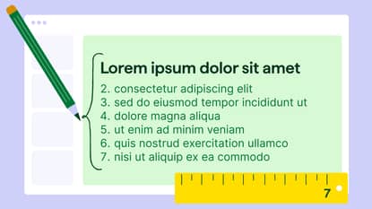
PowerPoint 7×7 rule: No more than seven lines of text per slide or seven words per line
Here’s an example of a slide that uses the 7×7 rule:

This concept is rooted in cognitive psychology and is based on how people process information. Too much text overwhelms your audience and distracts you as the speaker (you’ll learn more about this science in the next section).
Most small and mid-sized businesses (SMBs) don’t have full-time design teams. According to Venngage research, almost half of marketers struggle with design layout for data, stats or copy.
If you create your own, the 7×7 rule is a fast, reliable way to make business presentations look polished and perform better.
Keeping slides clean allows you to add the details verbally. By better engaging audiences, you make your message more likely to resonate.
You can apply it across almost any slide deck, including:
Internal team meetings. Summarize priorities, updates or key performance indicators (KPIs) without overwhelming your team.
Client-facing sales decks. Keep slides focused on value propositions rather than feature lists.
Investor updates. Communicate growth and sales metrics clearly and concisely.
Training presentations. Make content easier to digest for faster onboarding and knowledge retention.
Note: If you don’t use PowerPoint, apply the 7×7 rule in Google Slides, Canva, Venngage or any other tool where you create presentation slides.
No matter the setting, the 7×7 rule helps your audience understand, remember and act on what you share.

What are the psychological principles behind the 7×7 rule?
The 7×7 rule for PowerPoint taps into how our brains naturally process information. Using fewer lines and words reduces mental strain and allows your audience to focus on the important content.
Humans have limited attention spans and memory, especially in fast-paced business settings. When slides contain only the core information, people are more likely to grasp the message and listen to what you say.
Here are three core psychological principles that explain why the 7×7 rule works.
Occam’s Razor: our brains prefer simplicity
Occam’s Razor says that when faced with multiple options, we instinctively choose the one that requires the least mental effort to understand.
Our brains are wired to prefer simple, clear explanations over complex ones. Cleaner slides feel more intuitive and trustworthy to customers and prospects – especially in sales, where complexity often causes doubt or confusion.
Let’s say a small business owner is pitching her service to a potential client. Her original slide lists 10 features with chunky, jargon-heavy descriptions.
After applying the 7×7 rule, she uses fewer words and bullet points to explain benefits in plain language. The client immediately connects with the value and asks for a follow-up.
Cognitive Load Theory: keeps your audience engaged
The 7×7 rule reduces cognitive load (i.e., the mental effort to process a specific amount of information).
According to Cognitive Load Theory, people disengage or miss the point when you overwhelm working memory.
Here’s the basic process of how we process and remember information:

Limiting text and focusing each slide on one core message helps your audience stay mentally present and follow your narrative.
Imagine a founder presenting a financial report to investors. Instead of using a dense mix of text and graphs, she chooses to simplify her slide to a short headline, three bullet points and one chart.
Now, the audience listens intently instead of reading ahead or zoning out.
Miller’s Law: boosts clarity and recall
Miller’s Law says people can only hold about seven pieces of information in short-term memory. The 7×7 rule taps into this by limiting how much content appears on each slide to help your message stick.
Attention is crucial for impactful presentations and for what your audience remembers afterward. Focused slides improve learning and recall, and they’re especially useful in pitches, training or client onboarding.
Here’s a simplified representation of what that looks like:

For example, a sales rep is onboarding a new client. His original training deck covered too many steps simultaneously, and even an experienced colleague found it confusing.
After applying the 7×7 rule, each of his slides focuses on one key concept. The client retains more, asks fewer follow-ups and learns faster, reducing the need for ongoing support.

5 steps for SMBs to use the 7×7 rule in PowerPoint presentations
The 7×7 rule isn’t just a presentation design tip. This mindset shift compels you to simplify your message, prioritize content and communicate more effectively.
Here’s how you can apply it to keep your audience’s focus, step by step.
1. Draft key points before designing slides
Lay out your main points before looking at any presentation templates. Outline the ideas you want your audience to walk away with instead of starting with flashy visuals.
As an SMB, you often build decks quickly for clients, investors or your team. Without a straightforward narrative, you’ll likely pack in too much information instead of strategic storytelling.
Drafting core points before designing anything ensures you treat every slide like a stepping stone in the story.
For example, you might break down a sales presentation into 3–5 core takeaways: first, showing that you understand the customer’s pain points; then explaining how your product solves that problem; backing it up with proof, like a case study or key data; and finally, ending with a clear next step or call to action.
Focus on differentiating each page from the previous slide. Write down the key message you want people to remember, then design visual elements around it.
2. Limit slide text using the 7×7 rule
When drafting your copy, follow the 7×7 rule: there should be no more than seven lines of text per slide and line.
In sales, training or strategy sessions, overloading information makes you redundant as a speaker. The rule ensures your slides support your presentation skills. Here’s an example:

Let’s say you’re prepping a demo for a new client. Ensure each slide has five punchy lines (each under seven words) and expand verbally during the call.
As you’re not reading out text, you spend more time making eye contact, answering questions and building a stronger connection that leads to a sale.
Here’s how to stick to the 7×7 rule to create professional presentations:
Use bullet points to anchor your main takeaways
Avoid long sentences and think in headlines (e.g., “Team hit Q2 targets early” instead of “Our team successfully reached the second quarter’s goals ahead of schedule”)
If you need more detail, say it out loud, instead of writing it on the slide
Try specifically designed 7×7 PowerPoint templates to stick to the format
Don’t write down everything you want to say. Add just enough to keep your ideas top-of-mind and your audience engaged.
3. Use visuals to support, not distract
Use visual aids (e.g., charts, diagrams, icons or infographics) to reinforce your message without competing. The goal is to make your point more straightforward, faster and memorable.
According to Decktopus research, over 70% of audiences say slides should contain less than 25% text. However, nearly everyone agreed they should always include visuals.
A relevant graphic or screenshot helps your audience “get” topics in seconds, whether you’re explaining a sales funnel, client results or internal processes.
For example, here’s a quarterly sales chart where the data is the main feature

A rep presenting to a lead may want to show pipeline momentum. Instead of listing deal stages in text, he includes a customer relationship management (CRM) screenshot with open deals highlighted. This visual proof helps the client immediately grasp the tool’s value.
Here’s how to thoughtfully use visuals alongside your 7×7 PowerPoint design:
Replace blocks of text with a simple chart or infographic
Use icons to separate points or sections
Add screenshots from tools you use (e.g., your CRM system or analytics dashboard)
Keep visuals clean and avoid overdone animations or stock images that don’t add meaning
Use consistent visual styles (e.g., colors, fonts and layouts) to maintain a polished look
High-quality, relevant images and designs help you save time, build trust and make your message stick.
Download the Sales Presentation Templates ebook
4. Practice explaining the content aloud
Run through your deck aloud before presenting to confirm that your slides support your words. The 7×7 format means less text to read off the screen, which can trip you up if you aren’t prepared.
For busy SMB leaders juggling multiple roles, writing a full script might not be realistic. But practicing out loud helps you catch awkward phrasing, trim what’s not needed and feel more confident when it’s time to present.
Let’s say you find yourself reading each bullet word for word. Revise the title slides into lines of no more than seven words.
The next time you read through, you’ll explain points more naturally and leave space for questions.
Here’s how to ensure you turn your slideshows into conversations:
Present to a friend or teammate and ask, “Am I reading this or explaining it?”
If you can’t talk through a slide without reading it verbatim, simplify the content
Time yourself and look for places that drag or feel cluttered
Record a quick practice session to catch weak spots
Adjust the language on slides to act as cues, not scripts
By trimming your slides down into prompts and practicing in advance, you’ll land your message with clarity and confidence.
Note: If you’re nervous about public speaking, rehearse in low-stakes settings (e.g., with a colleague or in a team meeting) before high-pressure moments.
5. Design for quick scanning
Structure each slide so your audience understands it in under five seconds. Use layout, spacing and visual hierarchy to guide the eye.
SMB teams often present to busy clients, executives or stakeholders who skim first and focus second.
They’ll miss the message if your slides are visually chaotic or overly dense. Quick-scanning design like this slide with three short chunks of text helps your key points land instantly, even before you speak a single word:

Imagine you’re pitching a website redesign. Instead of cluttering the page with multiple screenshots and paragraphs of copy, you highlight a slide title and single concept (e.g., a “before and after” image).
The client instantly sees the difference, and the sales conversation moves smoothly.
Here’s how to design your 7×7 slides for quick scanning:
Use clear headers and large fonts for key takeaways
Left-align text so it’s easier to skim
Add white space between sections to avoid visual overload
Use consistent formatting (e.g., bullet styles or text sizes)
Choose one that best supports your point instead of mixing too many visuals on one slide. If your audience can’t pick up the central message of your slide in a few seconds, it’s time to simplify.

How to present engaging sales data using Pipedrive and the 7×7 rule
Use the 7×7 rule alongside Pipedrive’s sales reports to create clean, engaging slides highlighting one meaningful insight at a time.
SMBs often face pressure to present performance data in weekly team briefs, client check-ins or investor updates. Following the 7×7 rule makes it easier to incorporate that data clearly without cluttering slides with numbers and jargon.
The benefits extend to clients, teammates or executives, who can grasp what matters immediately and take action.
Pair your insights with a clear dashboard screenshot for more engaging decks, persuasive conversations and (often) shorter sales cycles.
Let’s say you’ve just wrapped up a batch of product demos and want to share what leads thought of the experience. You ran a short post-demo survey with three options and stored the answers in Pipedrive:
Very confident
Somewhat confident
Still unsure
Generate a CRM chart of that information by adding a new manual report:

You can also use the AI report generator to create one. Tell the AI tool, using your own words, what you’d like the report to focus on.
For example, you could say, “What were the results of last month’s product demo survey?”

Once you have the insights, choose the type of chart that best fits (e.g., funnel, bar or pie) and display only the metrics that support one key point. Here’s what that looks like:

When you’re happy, export the report and place it as the central visual in your PowerPoint slide. To highlight key insights, add no more than seven short bullet points (each under seven words).
Your final slide may look like this:

Sticking to one core chart and using minimal text leaves space for the story. As the presenter, you guide the audience through the “so what” without reading from the screen.
Whether it’s an internal review or pipeline stand-up, applying the 7×7 rule to your sales presentations helps you tell data-backed (not data-buried) stories.
Final thoughts
The 7×7 rule helps you create clear, focused PowerPoint presentations that are easier to deliver and capture your audience’s attention.
Include real business data from a robust CRM platform to make your slides more compelling.
Try Pipedrive free for 14 days to quickly generate charts and insights that strengthen your message and help grow your business.