Clear systems start with clear visuals. Take data flow diagrams (DFD): they help you understand how information moves through your software system so that you can design smarter workflows and stronger processes.
In this guide, you’ll learn what DFDs are, how they work and how to create one that fits your business process. You’ll also see real examples, helpful templates and best practices to bring your system design to life.
What is a data flow diagram?
A data flow diagram is a graphical representation of how data moves through a system. It shows the flow of information between processes, data stores, external entities and system outputs.
By mapping these connections, a DFD helps teams understand how information systems handle input and produce results.
Below is a sample data flow diagram of what a simple sales funnel process might look like:
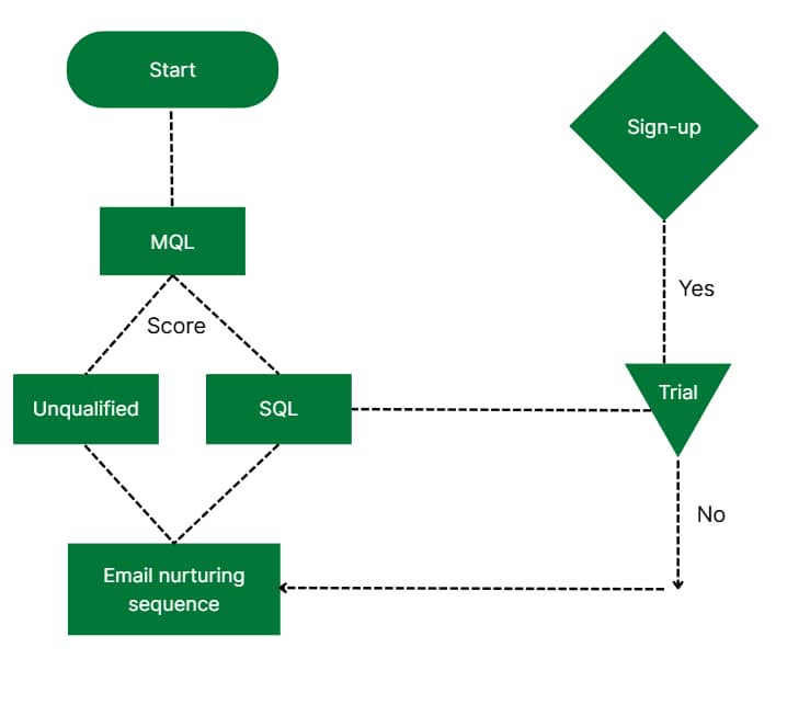
The example illustrates a sales prospect’s journey from marketing-qualified lead (MQL) to trial and sign-up. Each stage uses different shapes and colors to make the process clear.
Data flow diagrams can show different levels of detail, from a simple context diagram like the above to more detailed versions (more on these later).
This flexibility makes DFDs a powerful tool for both high-level strategic planning and detailed system design, no matter how simple or complex your process is.
To help you get started, you’ll find three downloadable DFD templates in the next section.
Data flow diagram templates
Using a template is the fastest way to start your data flow diagram and stay aligned with best practices.
Pipedrive’s ready-to-use data flow diagram examples in Google Slides show a lead nurture flow, a re-engagement sales pipeline and customer support operations. Customize any of these templates to fit your process: simply adjust the fields, expand the steps or adapt to your team’s workflow.
Download Pipedrive’s data flow diagram templates
Now that you understand what a data flow diagram is, it’s time to look at why they’re especially valuable for smaller teams.
Why are data flow diagrams important for SMBs?
Small and medium-sized businesses (SMBs) often run lean and agile projects and teams. A data flow model diagram lets these companies visualize how data moves through their information systems, making it easier to identify gaps and improve project management.
For example, a marketing agency might use a DFD to track how client briefs move from intake to delivery. It could map out data handoffs between sales, creative and billing teams to find areas for automation or cleanup.
Here are other ways a DFD can help:
Clarify roles and data movement between teams
Improve communication plans with stakeholders using a shared visual language
Spot inefficiencies and eliminate redundant subprocesses
Align system processes with real-world workflows
Make better system design decisions during software or process updates
Validate your high-level process with team feedback
Optimize resource use through workflow automation planning
In agile sales environments, where speed and iteration matter, DFDs provide a quick way for small teams to align on system flow without deep technical dives.
Note: Tools like Pipedrive make connecting your DFD to real workflows easier. For example, each pipeline stage in Pipedrive works as a DFD node, showing how deals and customer information move from lead capture to closing.
Everything you need to know about data flow diagrams
DFDs are powerful tools for illustrating data movement. While they share similarities with Unified Modeling Language, or UML diagrams, DFDs have a more focused purpose: breaking down the flow of data, not the structure or behavior of the system.
In this section, you’ll learn the core concepts, diagram formats and tools to help you create clear, effective DFD visuals that align with your business goals.
Types of data flow diagrams
Understanding the two types of DFDs helps you choose the proper format for your needs. Each plays a unique role in system analysis and design, depending on how much detail you need to show and who you’re sharing it with.
1. Logical DFD
A logical DFD focuses on what the system does, not how it does it. It shows the flow of information between key steps without diving into the technical setup.
Below is an example of a logical DFD where a customer selects items, the system looks up prices, calculates the total and processes payment:
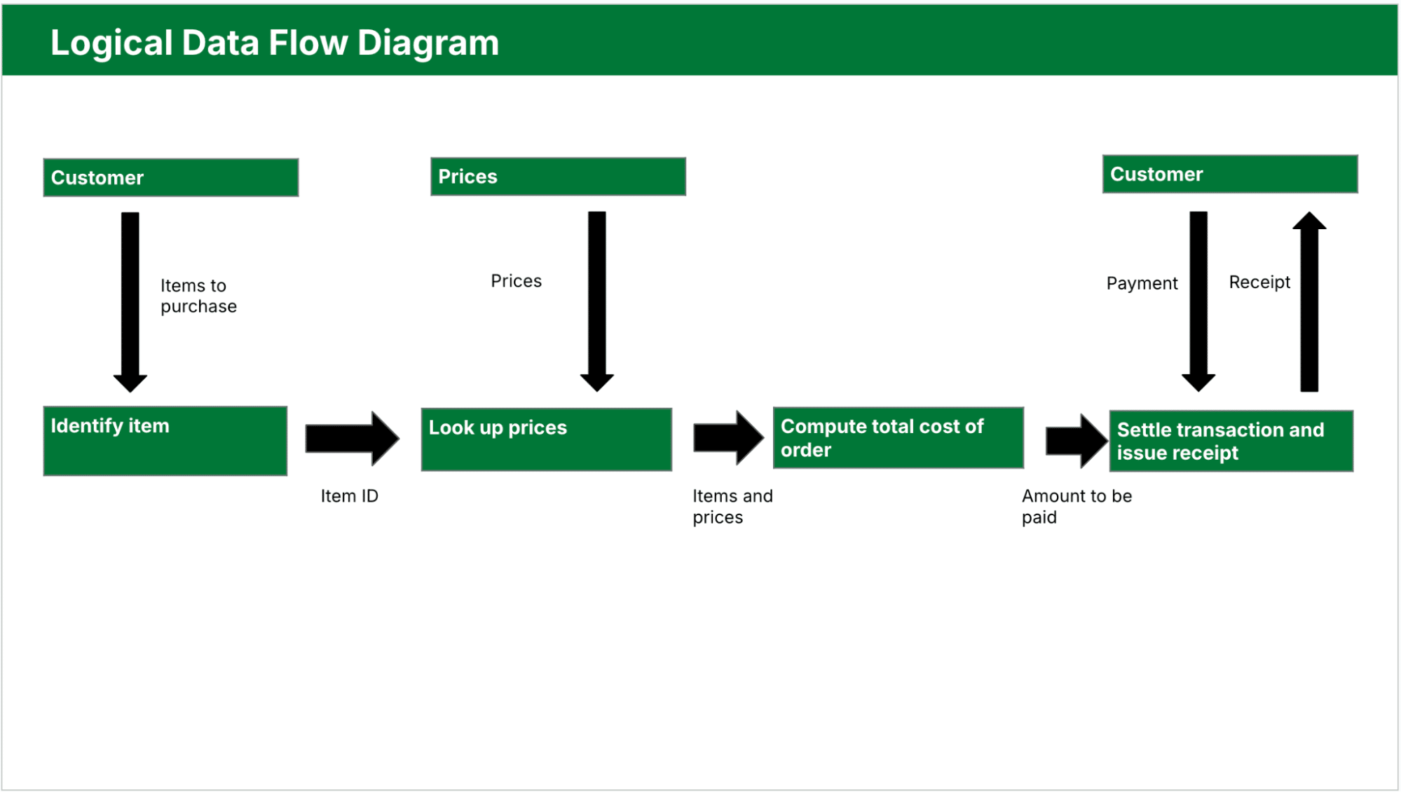
Teams use logical diagrams in the early stages of systems analysis to:
Define business processes clearly
Identify what data you need at each step
Validate workflows with stakeholders
Keep technology out of the conversation
This is the best choice when mapping a high-level process or collaborating with non-technical users.
2. Physical DFD
A physical DFD goes one step deeper. It shows more technical details, such as how users enter data, where systems store it and which tools handle processing.
Here’s a physical DFD example showing manual scanning, file lookups, temporary transaction files and specific data interactions:
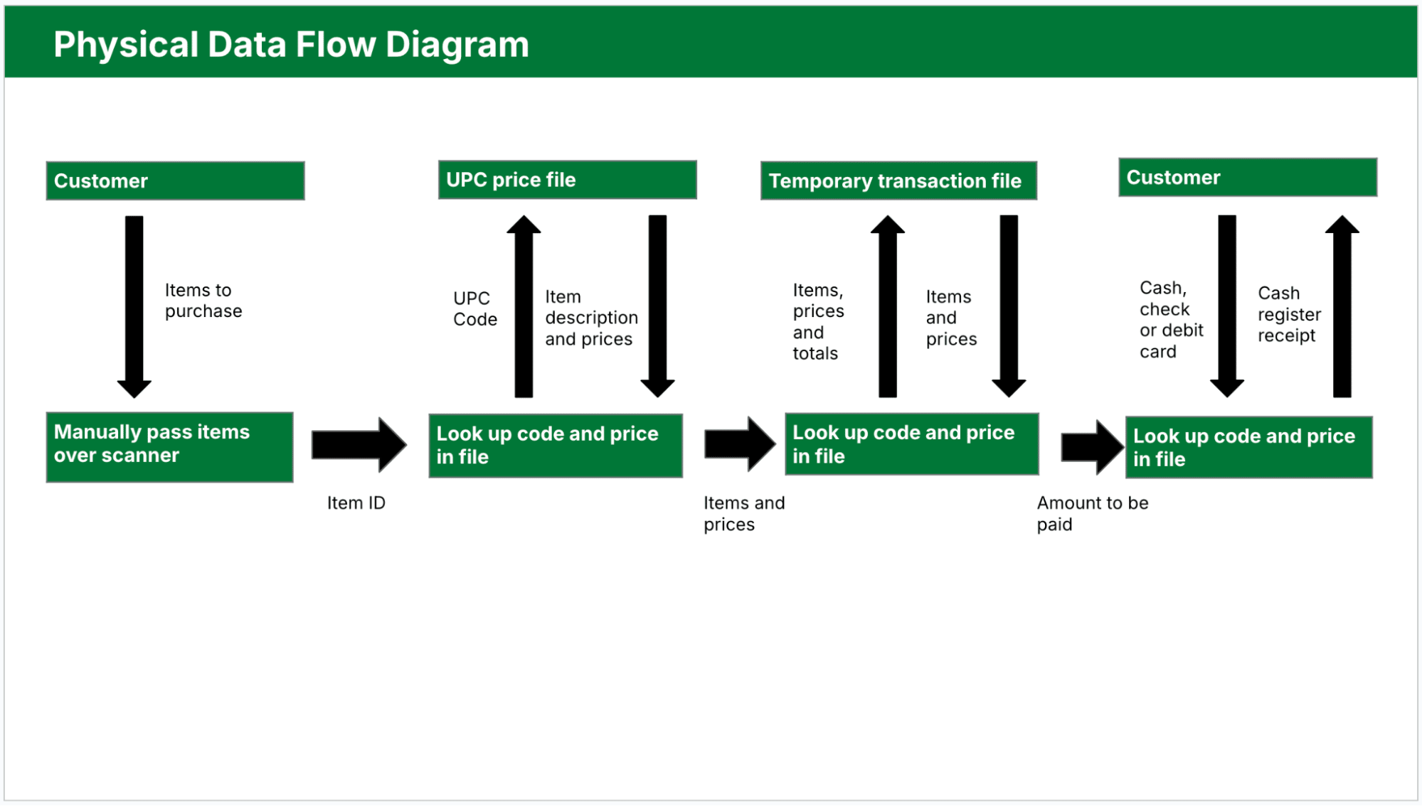
Physical diagrams are especially useful in real-time systems, complex systems with many data hand-offs and environments using automation. They also help you plan complex systems by showing how data moves through different components in a structured way.
Using logical and physical DFDs together gives you a complete picture of your system. The logical DFD maps user-facing workflows and data needs, while the physical DFD shows the behind-the-scenes technical setup.
4 main components of a data flow diagram
DFDs rely on a consistent set of symbols to make the data flow easy to follow. These symbols structure your diagram and make it readable for technical and non-technical stakeholders.
There are two main symbol notation styles: Yourdon and DeMarco and Gane and Sarson.
Yourdon and DeMarco notation represents processes with simple circles, making it a popular choice in general business and academic settings for its clarity and ease of use.
The Gane and Sarson style uses rectangular process boxes with rounded corners and bolded labels, which is preferable in more structured, object-oriented environments.
Both styles share elements like arrows for flows and rectangles for data stores.
Below are the four core components of a DFD diagram:
Element | Description and example |
1. External entities | Also known as terminators, they’re sources or destinations of data outside the system. They could be users, departments or third-party services that either send data into the system or receive data from it. Examples: customer submitting a form, payment gateway, shipping partner |
2. Processes | Sometimes called functions, these actions transform incoming data into outputs. A DFD usually represents them as rectangles with rounded corners or circles. Each process should have a clear purpose and label with a verb-noun phrase like “Submit Order” or “Send Invoice”. Examples: verify login, assign task, calculate total |
3. Data stores | Various types of data storage your system uses to house information until it moves to the next step in the process. These repositories could be databases, files, spreadsheets or even physical storage systems. Examples: customer database, inventory file, user preferences |
4. Data flows | Arrows that connect all the other components. Each shows the direction of movement and labels the type of transferred data. Clear labeling avoids confusion and makes the diagram easier to validate. Examples: order details, login credentials, shipment status |
Using these standard elements makes documenting your system accurately and creating diagrams simpler.
Data flow levels
DFDs show systems at different levels of detail. Using varied levels of data flow diagrams helps you control the complexity, so you can focus on the big picture or zoom into specific parts as necessary.
Level 0 DFD (Context Diagram)
This most basic version of a data flow diagram treats the system as a single process and focuses only on how it connects with the outside world. Here’s a brief breakdown of what it entails:
View – shows the entire system as one process with arrows going to and from external entities
Purpose – provides a quick overview of how the system connects to external users, tools or departments
Use case – great for sharing with stakeholders who need to understand the system at a glance
Level 1 DFD
Once the context is clear, Level 1 dives deeper by breaking the single process into smaller subprocesses. This level starts to show how the system works internally.
View – breaks the main process into multiple functions and includes data stores
Purpose – shows how data flows between different parts of the system without overwhelming detail
Use case – ideal for internal planning sessions, process reviews or workflow mapping
Level 2 DFD and beyond
Level 2 and lower levels unpack each subprocess even further for deeper detail. Depending on the system’s complexity, these diagrams can be as intricate as needed.
View – expands subprocesses into their own detailed flows, possibly creating multiple linked diagrams
Purpose – helps with system design, testing and technical documentation by showing exact data movement
Use case – developers, system architects or QA teams can deploy it to support implementation and automation
Choosing the right level depends on your audience, activities and goals. Start with a high-level view to align on the big picture, then add the required detail for planning and further design.
Now that you understand how to structure your diagram, the next step is to see how DFDs apply to real business scenarios.
Examples of how to use a DFD
Data flowchart diagrams are practical tools for mapping business processes across teams, no matter what type of business you’re in.
Here are a few real-world examples of how DFDs clarify systems, automate workflows and improve operations.
Sales pipeline follow-up process using Pipedrive
Sales teams often lose momentum when follow-ups fall through the cracks. A DFD can help map a structured follow-up system using automation and manual touchpoints within Pipedrive’s customer relationship management (CRM) tool.
Here’s how that process might work:
A CRM trigger (external entity) starts the process when a deal goes cold after seven days
A “Send Follow-Up Email” process launches, pulling sales email templates from a shared content data store
If there’s no response, data flows into a “Schedule Reminder Task” process for the sales rep
After making contact, the rep logs notes into a deal record (data store), restarting the engagement
Mapping this workflow as a Level 1 DFD (per the Pipedrive template example below) helps teams identify where to automate and where human input adds the most value. It also ensures no loss of sales opportunities due to inconsistent follow-up.
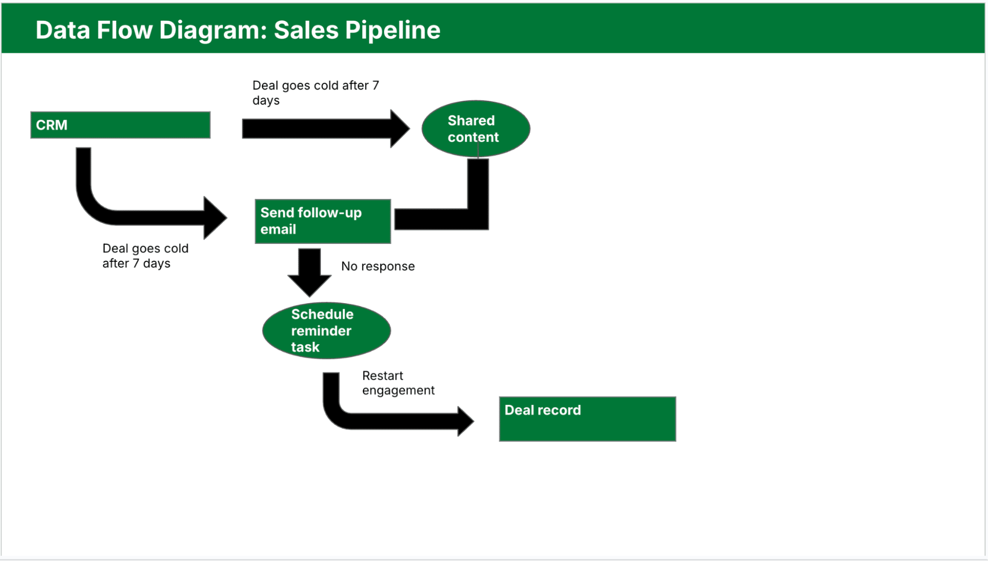
Each Pipedrive stage represents a process node, helping sales teams see how information systems support the journey from lead outreach to closed deal.
Marketing automation workflow
A DFD can also clarify how marketing management tools work together to generate leads and nurture them. For instance, you might have:
Website visitors (external entity) submitting contact info
A “Collect Lead” capture process that pushes the data into a CRM (data store)
A “Trigger Email Sequence” process that launches based on tags or behavior
Email data sent to an external service like Mailchimp (external entity)
Below is the Pipedrive template showing this workflow in DFD format:
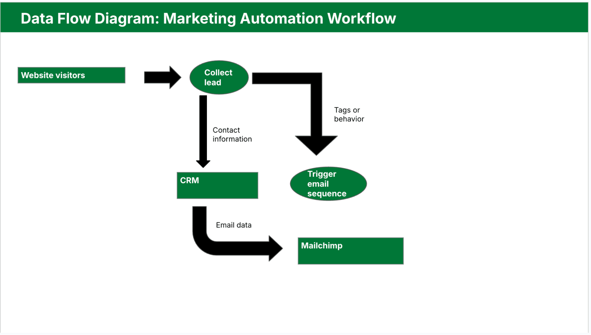
Mapping this process as a DFD reveals where to improve automation or where data loss between sales tools is likely.
Customer support ticketing system
A DFD can help customer support teams streamline issue resolution by tracking how they create, assign and resolve tickets:
Customers (external entity) submit requests via a help form
Requests go into a “Create Ticket” process
Support database (data store) stores tickets
The “Assign Agent” and “Resolve Ticket” processes handle the internal workflow
The system sends ticket outcomes to customers
Here’s what this ticket system would look like as a DFD:
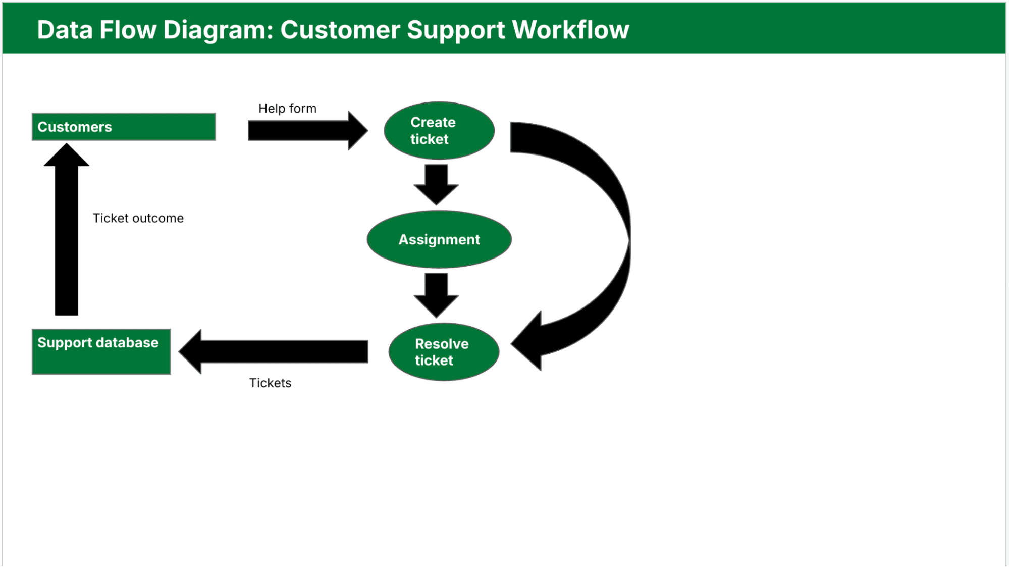
Using this model, managers can pinpoint bottlenecks or redundant subprocesses in the support workflow.
Note: In Pipedrive, you can use custom fields, pipeline stages and workflow automation to represent the different parts of your DFD. Each custom field can act as a data input or status flag, while automation rules handle common transitions like follow-ups and deal updates between processes.
Next, find out how to create your own data flow diagram from scratch, plus a few best practices for inspiration.
How to make your own data flow diagram
If you already use Pipedrive, your sales or project pipeline is a great starting point for a DFD. Each stage in your pipeline represents a process or status change, while your custom fields, activities and automations reflect how data moves through each step.
The image below shows a typical pipeline view in Pipedrive:
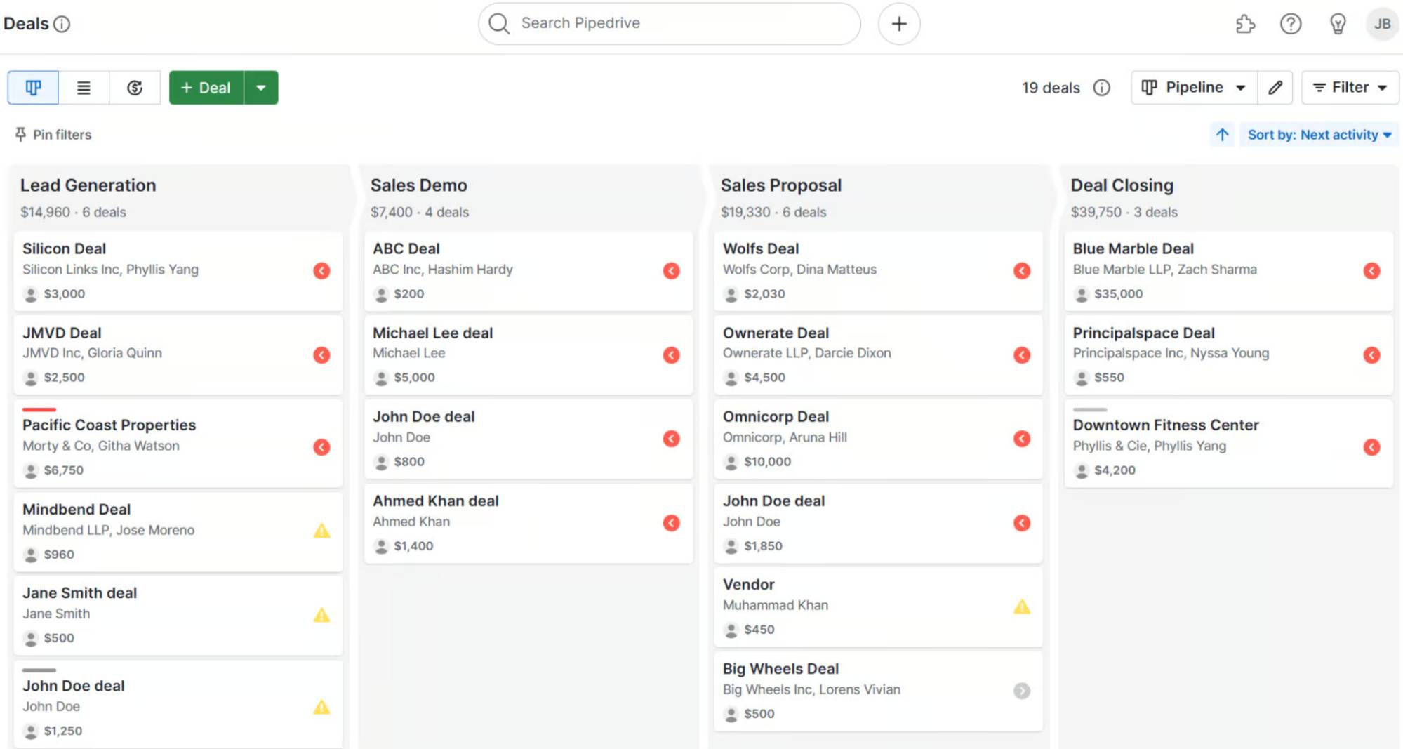
Use it to map out key processes, identify external entities (like email capture forms or webhooks) and define what information flows in and out of each stage.
From there, follow the steps below to build your custom DFD.
1. Pick the process you want to map out
Choose a single business process that involves multiple steps, systems or data exchanges. The process could be client onboarding, a support ticket workflow or handling product returns.
Be clear on what you want to understand. Maybe it’s where delays happen or how data moves between teams.
For example, a B2B sales team might map how it requests, reviews and delivers pricing quotes. Starting with focused sales goals helps keep the DFD relevant and manageable.
2. Find a template
Templates save time and help maintain consistency in layout and symbol usage. Most data flow diagram templates come with standard shapes:
Circles for processes
Arrows for data flow
Rectangles for external entities
Open-ended rectangles for data stores
Use digital tools like Lucidchart, Draw.io or Visio to get started. These platforms often include editable templates you can adapt to your process. Just swap out placeholder text and update the flow based on your real system.
3. Start at Level 0
Begin by drawing a Level 0 DFD, or context diagram. Represent your entire system as one process and connect it to external entities like users, vendors or tools. This step helps define the system boundary and gives everyone a clear starting point.
For instance, if you’re mapping a deal review process in Pipedrive, your Level 0 diagram might show “Manage Deal Pipeline” as one process connected to a sales rep (external entity) and a reporting dashboard (another external entity).
Once the overall flow is clear, move to Level 1 and break the process into steps like “Qualify Deal,” “Assign to Rep” and “Review Forecast.” You’ll gain a more comprehensive view of how data moves from initial entry to deal analysis.
4. QA your DFD with your team
A DFD is only valid if it reflects how things actually work. Share your draft with team members who run, manage or rely on the process. Walk through each step to confirm it’s correct and complete.
This step is crucial for catching missing stages, unclear labels or overly complex flows. For example, someone might notice a forgotten manual task, like confirming refund approvals. This feedback loop turns your diagram into a reliable planning tool, not just a static document.
Note: For ongoing process tracking and task coordination, Pipedrive’s project management software offers a great way to extend your DFD into daily execution. Break down each step of your diagram into actionable tasks, assign ownership and monitor progress in real time.
Data flow diagram best practices
A well-crafted DFD helps your team communicate clearly, spot issues and design systems that scale.
Below are some best practices that ensure your diagrams stay accurate and useful over time.
Start simple: Outline the entire system as a single process with a Level 0 DFD. It’ll help everyone understand the big picture before diving into subprocesses.
Use consistent labels: Keep process names, data flows and data stores the same across all levels. Consistency avoids confusion and makes it easier to trace the flow of data.
Validate with stakeholders: Review your diagram with team members and subject matter experts. Their feedback ensures you haven’t missed steps or misrepresented workflows.
Limit clutter: Each diagram should focus on a single level of detail. If it starts getting messy, break it down into lower-level DFDs to keep each one readable.
Stick to standardised diagram symbols: Use commonly accepted shapes for processes, entities and data stores. Your DFD will be easier to understand for both technical and non-technical users.
Label all data flows: Every arrow in your diagram should have a clear, descriptive label. Accuracy is key to showing exactly what information is moving through the system.
Avoid unnecessary repetition: Don’t show the same data flow multiple times across diagrams unless it adds clarity. Redundancy can make diagrams harder to follow.
Document assumptions: If your DFD includes estimated flows or planned features, note them outside the diagram. Keep the core diagram focused on confirmed details.
Following these tips helps you create diagrams that are clear, scalable and aligned with structured design principles.
Final thoughts
Data flow diagrams are useful visual representations that turn complex systems into clear, visual workflows. By mapping how data moves between complex processes and stages, DFDs help teams design systems that scale.
Pipedrive makes it easy to operationalize your DFDs by aligning sales and marketing workflows with real-time data movement.
Try our 14-day free trial to map and track your business processes using tools like pipeline management, email campaigns, project management and more.
