Sales teams track dozens of metrics – from lead conversion rates to deal cycle length – but doing it in spreadsheets takes forever. With so much information coming in, it’s hard to spot the patterns that help you hit your targets.
A sales graph changes that by showing your data visually and making it easier to understand. You see trends and make decisions based on clear evidence instead of guesswork.
In this article, you’ll learn how to read sales graphs like an expert, build your own tracking system and present data in ways that impress stakeholders and advance your career.
Key takeaways from sales graphs
A sales graph turns spreadsheet data into visual insights that help you spot trends and make faster decisions.
Visual data eliminates guesswork by highlighting patterns, seasonal changes and performance gaps that spreadsheets hide in plain sight.
Different graphs answer different questions. Use line graphs for performance over time, bar graphs to compare categories and pie charts to see where your revenue comes from.
Pipedrive automatically creates these charts from your CRM data, so you spend less time building reports and more time acting on insights. Start your 14-day free trial to see how it saves time and gives you data-backed stories to present to stakeholders.
What is a sales graph and why does it matter
A sales graph is a way to visualize your data. It makes it much easier to understand patterns than scanning through numbers in a spreadsheet.
The main benefit is clarity. When your sales manager asks how Q3 revenue compares to last year, you can reference a line graph instead of calculating percentages. Charts make profit drivers immediately apparent across product lines.
Spreadsheets store your sales data, but graphs make that data easier to interpret.
A spreadsheet might show you sold 150 units in January and 180 in February. A graph makes it clear you’re on an upward trend that could hit 250 units by April if it continues.
How to choose the right sales graph
Different types of graphs have different use cases. Here’s a guide for when to use each type of sales graph in your work.
Use line graphs to track trends over time
Line graphs show how metrics change over time. They help track business growth, conversion rates or any number that moves up and down over weeks or months.
The horizontal axis shows time periods, like months or quarters. The vertical axis shows your sales metric, like revenue or deals closed. Each point on the line represents performance for that specific time.
Here’s an example line graph that’s a combined sales report and forecast:
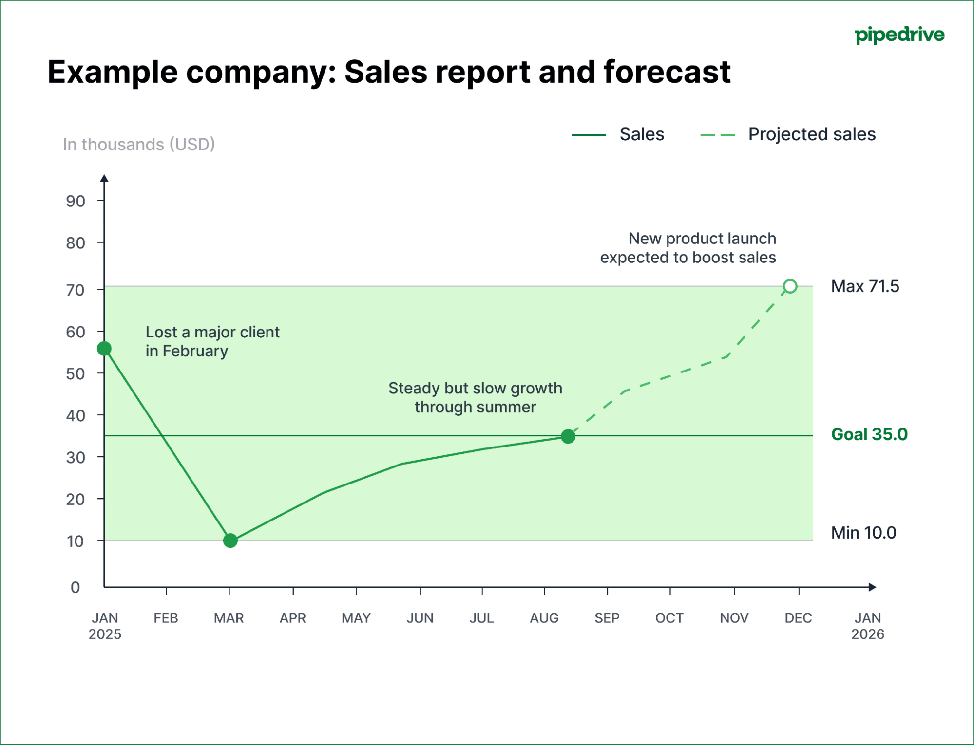
The solid line shows actual sales (the sales report part), with revenue on the vertical axis and months along the horizontal axis. The dotted line shows forecasted sales.
Annotations help viewers understand what’s happening, even if they aren’t professional data analysts.
The example above shows the highest and lowest recorded sales, the goal amount and notes that explain dips and why the forecasted sales are so much higher.
Line charts work best for:
Tracking sales revenue growth over months or quarters
Monitoring conversion rates to spot performance changes
Identifying seasonal patterns in your sales
Showing progress toward annual targets
Comparing this year’s performance to last year’s
They make trends obvious that would take much longer to spot in a spreadsheet.
Use bar graphs to compare performance
Bar graphs compare different categories side by side. Each bar represents a distinct group, like sales reps, products or regions. The height of each bar shows the value, making it easy to see who or what performs best.
For example, a bar graph might show five sales reps on the horizontal axis and their monthly revenue on the vertical axis.
Everyone can see the top performer when presenting to your team without reading the numbers.
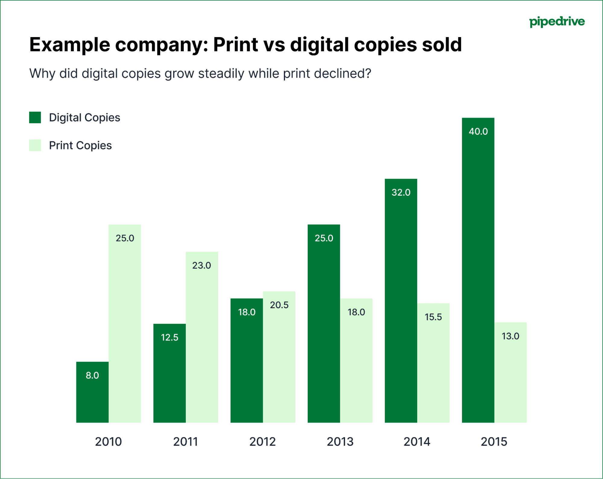
Here’s an example bar chart that compares print copies sales to digital sales:
Bar graphs work best for:
Comparing individual sales rep performance
Ranking products by revenue or units sold
Measuring different sales territories or regions
Showing monthly or quarterly performance side by side
Identifying top and bottom performing products quickly
Comparing your current period’s results to your targets
You can also use bar graphs to compare the same metric across different periods. For example, your bars might show revenue from Q1, Q2, Q3 and Q4 to see which quarter performed best.
Use pie charts to understand the spread
Pie charts show how your total breaks down into parts. Each slice represents a percentage of the whole, making it easy to see what contributes to your overall sales performance.
For example, a revenue pie chart might show that software sales make up 60% of your business, consulting accounts for 25% and training accounts for 15%.
Here are two pie charts that show how certain products bring in a larger percentage of revenue than others:
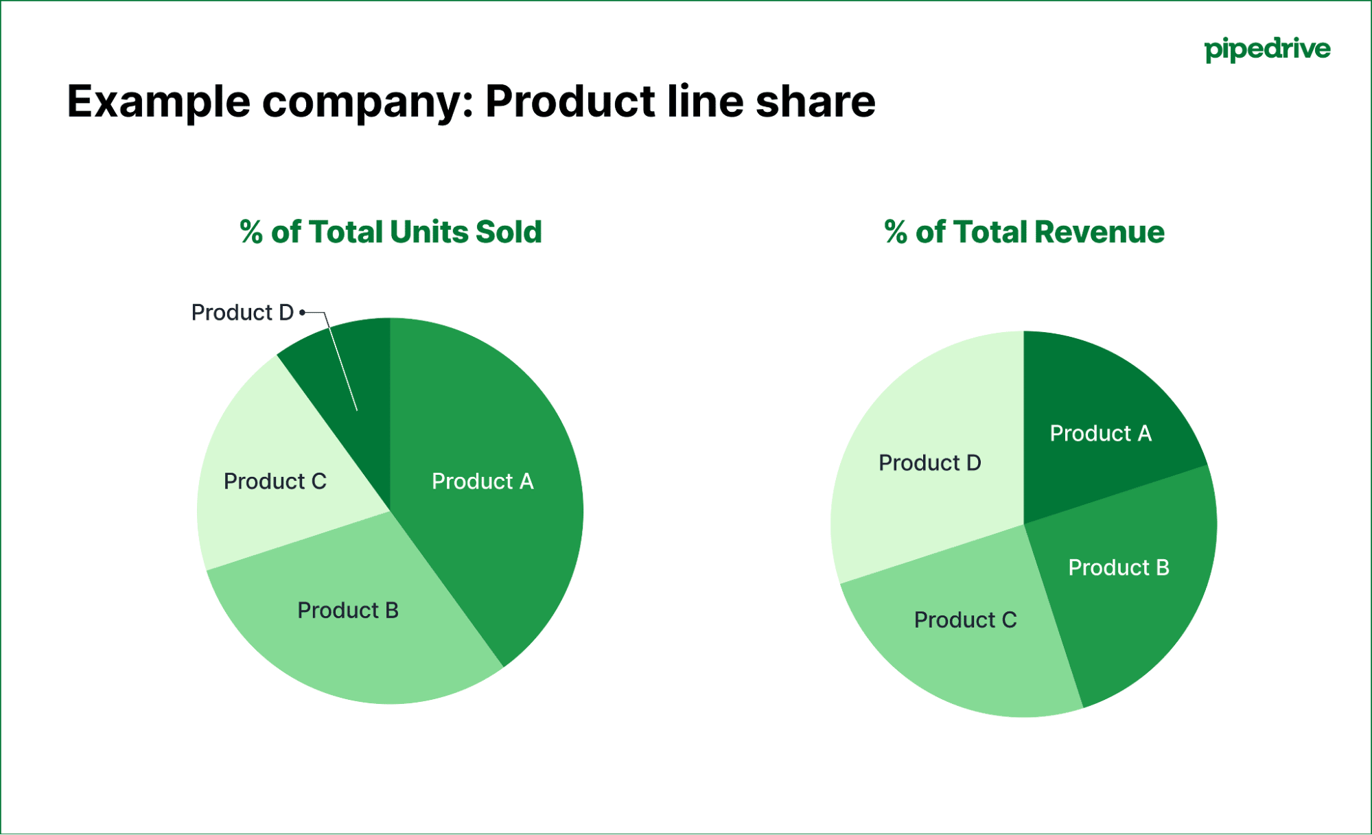
In the first graph, you can see that Product A makes up the largest share of total units sold, while Product D accounts for the smallest share. Yet in the second graph, it’s clear that Product B and Product A bring in a much larger share of total revenue compared to the number of units sold.
When presenting to stakeholders, this makes it easy to show that some product lines (like Product B) may sell fewer units but generate more revenue, highlighting where the business’s most profitable opportunities lie.
Pie charts work best for:
Breaking down revenue by product line or service type
Showing lead sources and their contribution to your pipeline
Displaying how you allocate time across different sales activities
Presenting your company’s market share within your industry
Illustrating how you spread the budget across sales initiatives
Demonstrating customer segments by value
Pie charts are most effective when you don’t have too many categories. Too many thin slices become hard to read and compare.
Use combo charts to see multiple metrics together
Combo charts combine different graph types to show related metrics at once.
For example, your chart could show your revenue as bars and the conversion rate as a line. If revenue grows but conversion rate drops, you’re probably generating more leads but closing a smaller percentage.
Here’s another example where the bar chart shows revenue (in millions), while the line graph tracks customer acquisition cost over the same period:
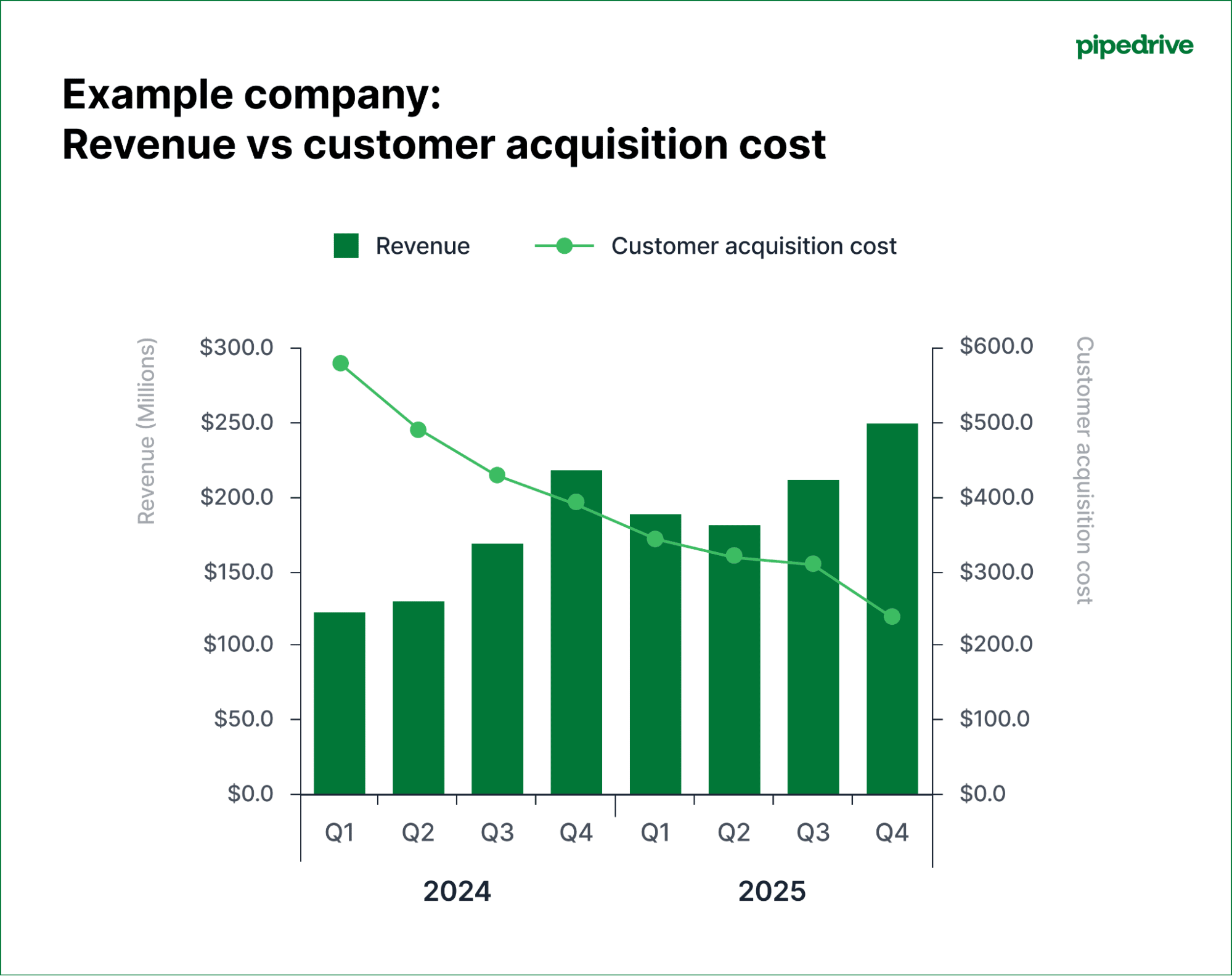
When presenting this to your manager, this makes it clear that the company is becoming more efficient – bringing in higher revenue while spending less to acquire each customer.
Combo charts work best for things like:
Tracking revenue alongside sales KPIs like deal volume or average deal size
Comparing actual performance to sales targets on the same chart
Showing pipeline value by displaying win rates per month
Displaying activity metrics with the results they generate
Presenting cost per lead (CPL) alongside lead quality metrics
The trick to combination charts is titling and labeling each part so that it’s clear what’s happening.
How to read and interpret sales graphs like a pro
Reading a sales graph starts with knowing what to look for. The chart presents the evidence, but you must know how to look for clues, ask the right questions and piece together what’s happening in your sales pipeline.
Here’s what to look for in each type of graph.
Line graphs: identify trends by looking at the direction and momentum
A trend is the overall direction of your data. Simply saying “it’s going up” isn’t enough. The fundamental insight comes from analysing the trend in more detail.
First, analyze the slope (the steepness of the line graph). The steepness tells you the speed of sales growth or decline.
A revenue line trending upward is good, but you also need to look at the growth angle. Is it accelerating or starting to flatten?
Here’s what to look for:
Line graph data analysis | What it means (and what to ask next) |
Steeply rising line | Shows rapid growth. Ask: What did we start doing differently during this period? Was it a new marketing campaign or product launch? Can we replicate this? |
Shallow or flat line | Suggests stagnation or slow growth. Ask: Are we facing market saturation? Is our team hitting capacity? How can we fix this? |
Steeply dropping line | Shows that your sales numbers are dropping quickly. Ask: What’s going wrong? Is a competitor’s product outcompeting ours? How do we reverse the trend? |
Next, look for changes in momentum (the curve of the line). If the curve is getting steeper, it’s accelerating. That means your efforts aren’t just adding to your sales, they’re multiplying them.
A steeper curve is always a sign of a scalable sales process.
In contrast, if the curve is getting flatter, you’re losing momentum. It’s a warning sign that, even if your revenue is still growing, you might be reaching a point of diminishing returns.
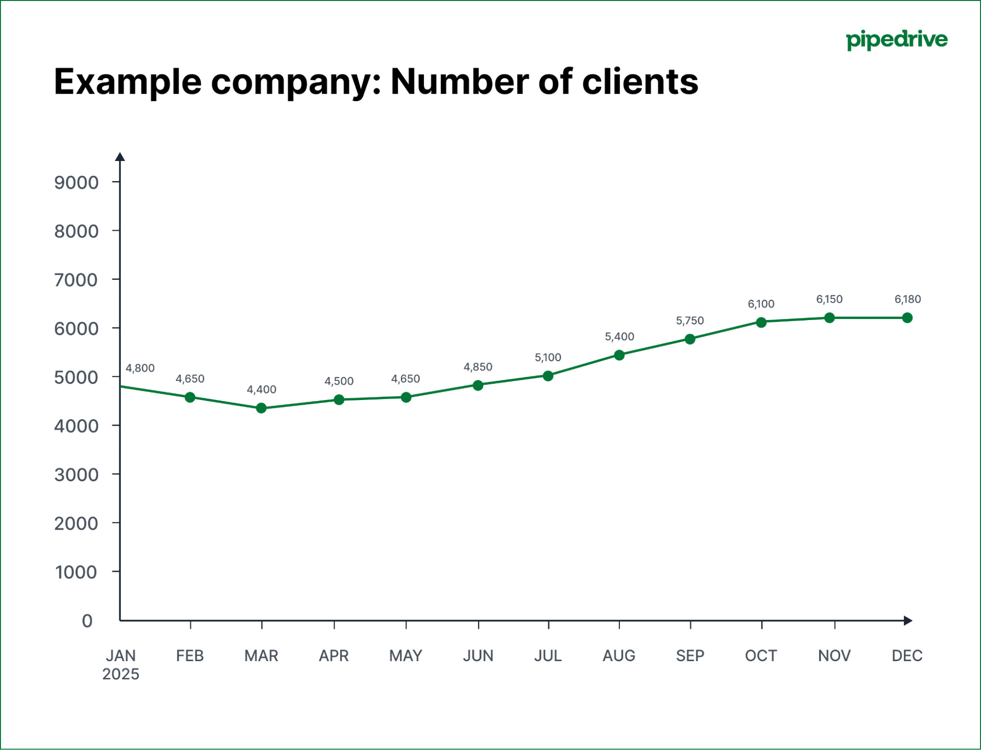
A flatter curve tells you it’s time to revisit your sales process, test new tactics or expand into fresh channels to regain momentum.
Finally, look for volatility. If your graph is a smooth, steady line like above, it suggests that you have a predictable sales performance. If it’s a jagged line like the example below, something is inconsistent:
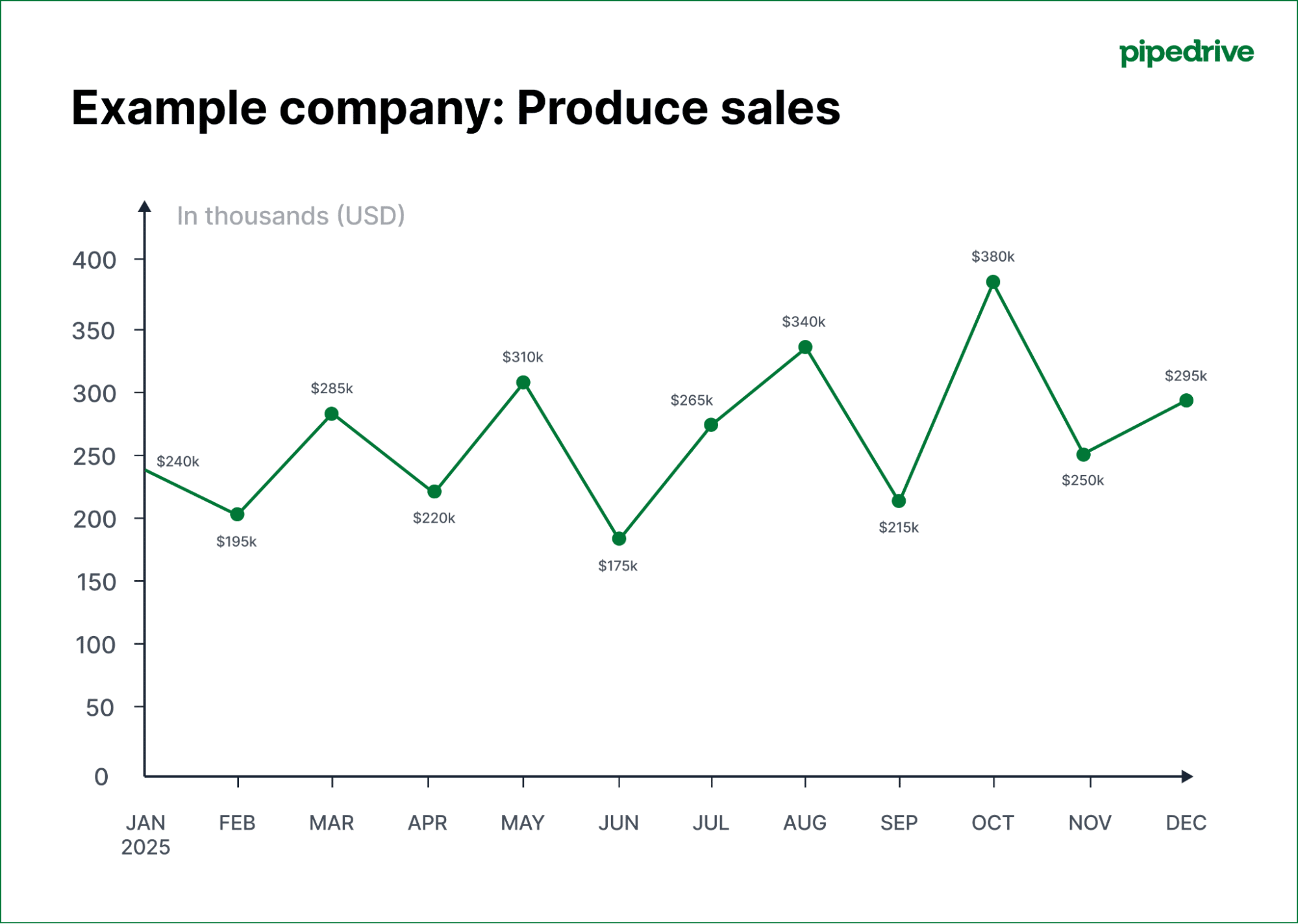
In this case, you need to ask why. The fluctuations might be due to seasonal differences or pricing promotions or they could indicate that your sales process needs adjusting.
Bar graphs: compare categories by analyzing heights and gaps
While line graphs show data over time, bar graphs compare different categories at a single point in time.
First, compare the heights of the bars to see which categories are the biggest and smallest:
Bar chart height analysis | What it means (and what to ask next) |
One bar is much taller | Shows a dominant performer. Ask: What makes this salesperson/region/product so successful? How can we apply it to the rest of the team? |
Bars are similar in height | Suggests even performance. Ask: Is our sales training practical? Is this a sign of a healthy team, or can we increase performance? |
One bar is much shorter | Shows an underperformer. Ask: What challenges is this salesperson, region or product facing? Do they need more sales enablement to succeed? |
Next, look at the gaps between the tops of the bars. A significant difference between your top performer and everyone else could mean you have a superstar pulling away from the pack.
A narrowing gap suggests that your training programs are working and that other team members are successfully catching up.
When you analyze the heights and gaps, you can quickly spot the strongest and weakest links in your sales efforts and decide where to focus your coaching attention.
Pie charts: understand proportions by looking at slice size
Pie charts show how much each category contributes to the total. To interpret them, you need to compare the relative size of each slice.
Here are a few things to look for:
Pie chart analysis | What it means (and what to ask next) |
One dominant slice (over 50% of the total) | Shows a heavy contribution from one thing. Ask: Are we too reliant on this single product or customer segment? What’s our financial risk if this segment suddenly drops? |
A few evenly-sized slices | Suggests a balanced distribution. Ask: Does this mean our portfolio is well-diversified? Or do we lack a single “killer” product that dominates the market? |
Many tiny slivers | Indicates that your efforts are all over the place. Ask: Are these small customer segments a distraction? Is the effort we put into serving these niche markets worth the small return? |
While simple to read, be cautious with pie charts. They become difficult to interpret when there are more than five or six slices.
They’re best for providing a quick, high-level snapshot of your business composition, helping you see where the most significant revenue streams are coming from.
All graphs: investigate outliers and anomalies
Outliers are data points that differ dramatically from the rest of your graph. They’re valuable because they represent something exceptional – either good or bad.
Pinpoint the exact data point. A single bar on a chart that is twice as tall as any other or a point on a line graph that suddenly drops to near zero.
Here’s what to look for:
Sales graph outliers | What it means (and what to ask next) |
A huge spike | An unexpected and considerable rise in sales or conversions. Ask: What caused this and can we do it again? Did one salesperson have a record-breaking month? Was it one enterprise sale that finally closed? |
A massive plummet | A sudden, catastrophic drop. Ask: What can we do to stop the drop? Did a key salesperson resign? Was there a technical issue on our website? |
Before you panic or celebrate, rule out simple mistakes. A misplaced decimal point or a problem during data migration can create an outlier that isn’t real. Always verify the source data first.
If it’s real, compare the outlier across different charts to find the reason. For example, if you see a spike in “deals won”, pull up the “new leads created” chart for the last period.
You might find that a marketing campaign created a surge of high-quality leads that caused the sales peak.
Note: Scatter plots are a good way to see data spread. They show each data point as a single dot, letting you see how closely they group (if some are way out of the norm).
How to create a sales graph in Excel
Tracking sales progress is essential for understanding performance. Many build sales graphs using spreadsheet software like Microsoft Excel or Google Sheets.
Creating a sales graph in these apps involves organizing your data with time periods in one column and sales figures in another, then using their built-in charting tools to visualize trends.
For example, here’s how to make a projected sales graph in Excel:
Prepare your data: Set up your Excel sheet with time periods in column A (like Jan, Feb, etc.) and sales values in column B. Keep your periods consistent. If you use months, stick to monthly throughout for an accurate forecast.
Visualize historical performance: Click and drag to highlight all the cells containing your data, including the headers. Press “Insert” and choose “Charts”. Select the “Line Chart” icon, and Excel will generate a chart that shows your sales history.
Add a predictive trendline: Right-click on the line in your new chart and press “Add trendline”. Excel will add a straight dotted line over your data, showing the general trend of your sales.
Extend the trendline to forecast sales: The “Format trendline” menu should appear on the right-hand side when you add the trendline. Look for the “Forecast” section and type the number of future periods (in months if you used months) for Excel to project.
Title and label your graph: Select the “Chart title” and give it a name, like “2025 Sales Forecast”. Next, select the “+” icon next to your chart and check the box for “Axis Titles”. Label the horizontal axis “Sales ($)” and the vertical axis “Month”.
While learning how to create a sales graph in Excel is relatively easy, this manual approach has significant limitations. Every data update requires rebuilding charts, adjusting formulas and reformatting presentations.
For sales teams managing multiple metrics and frequent reporting cycles, this becomes a productivity bottleneck that diverts energy from revenue-generating activities.
How to make a sales graph in Pipedrive
Creating sales graphs in your customer relationship management (CRM) software is faster and better. It already holds your real-time sales data and most CRMs have built-in reporting features that generate graphs automatically.
Pipedrive in action: The BlackTies is a powerful example of how sales reporting helps boost performance.
The high-end magician company struggled to organize sales and follow up on leads.
With Pipedrive’s reporting features, it could finally get a clear view of its sales funnel and conversion rates. Within a year of using Pipedrive, it increased revenue by 120% and doubled its sales lock-in rate.
Here’s how to use Pipedrive’s CRM charts to make essential sales graphs that track your performance.
Track your personal pipeline velocity in Pipedrive
Sales velocity measures how quickly deals move through your pipeline and how much revenue you can expect over a period.
A higher velocity means you’re making more money in less time. Tracking this helps you spot bottlenecks and understand the overall health of your pipeline.
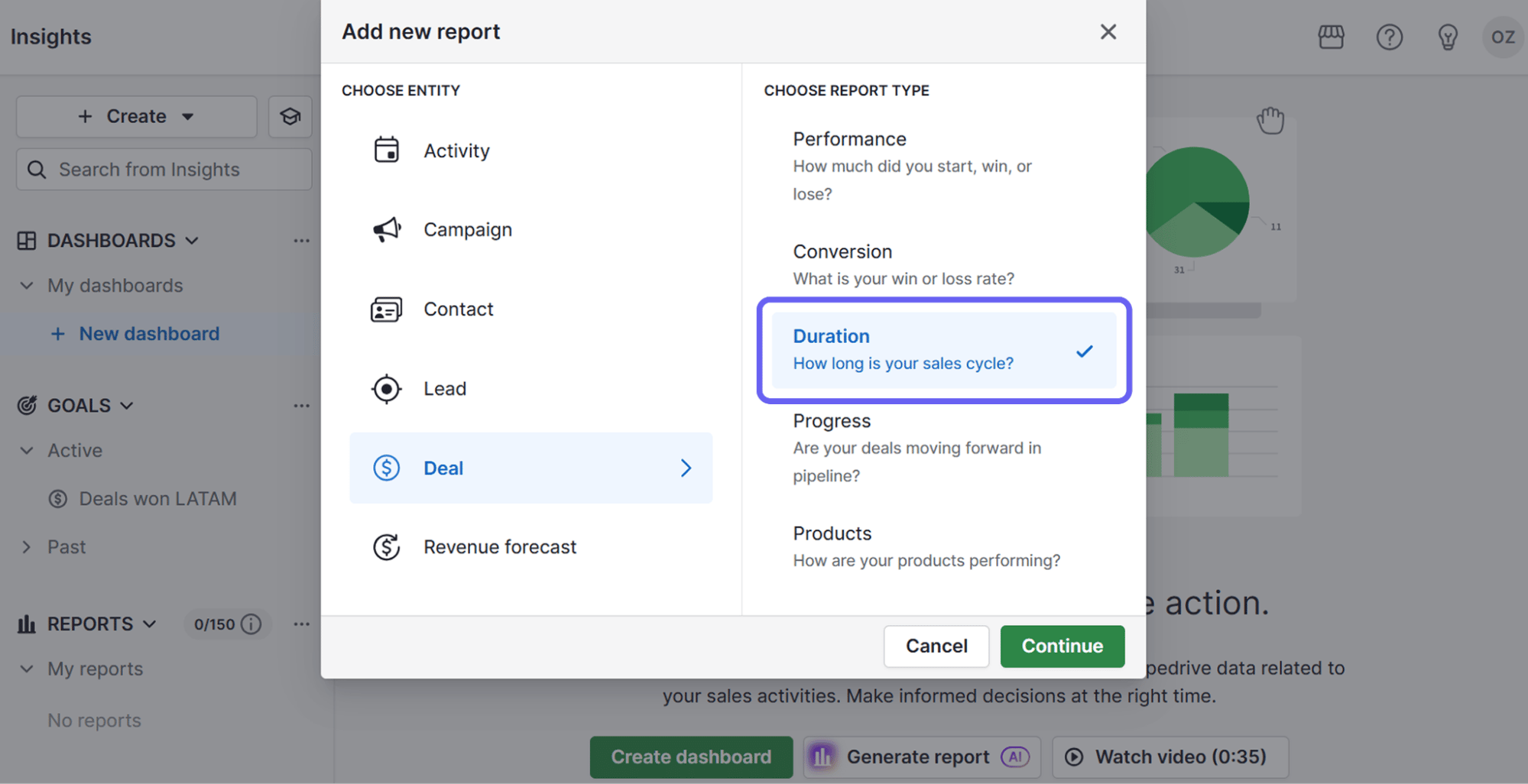
To create a deal velocity report with Pipedrive’s reports and insights feature, navigate to the “Insights” tab on the left-hand sidebar. Click the green “+ Create” and choose “Report”, then select “Deal”.
Pipedrive has a pre-built report for this, which you can find in the list of report types. Choose “Duration”, select the time frame and hit “Save” to finalize the report in your dashboard.
You can also create reports with Pipedrive’s AI report generator. Click “+ Create” and select “Generate report (AI)”. Type a prompt to tell Pipedrive what kind of report you need or choose from the suggested examples.
Pipedrive’s AI will instantly generate that exact report without you needing to navigate through the menus.
Analyze your lead source performance in Pipedrive
A lead source graph shows which marketing methods generate leads that close. It helps you focus prospecting efforts on the sources that deliver the most promising sales opportunities.
To analyze your lead sources in Pipedrive, go to “Insights”, press the “+ Create” button and choose “Report”. Choose “Deal” and select “Conversion”.
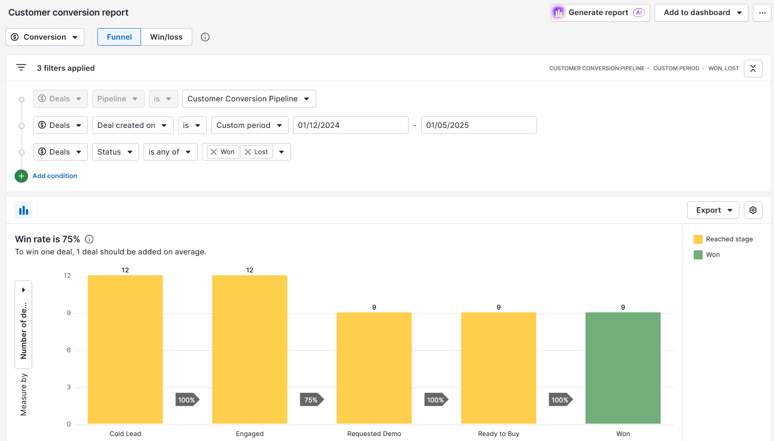
Click the “Segment by” dropdown menu on the right-hand side in the report view. Select the “Lead source” chart template from the list of fields.
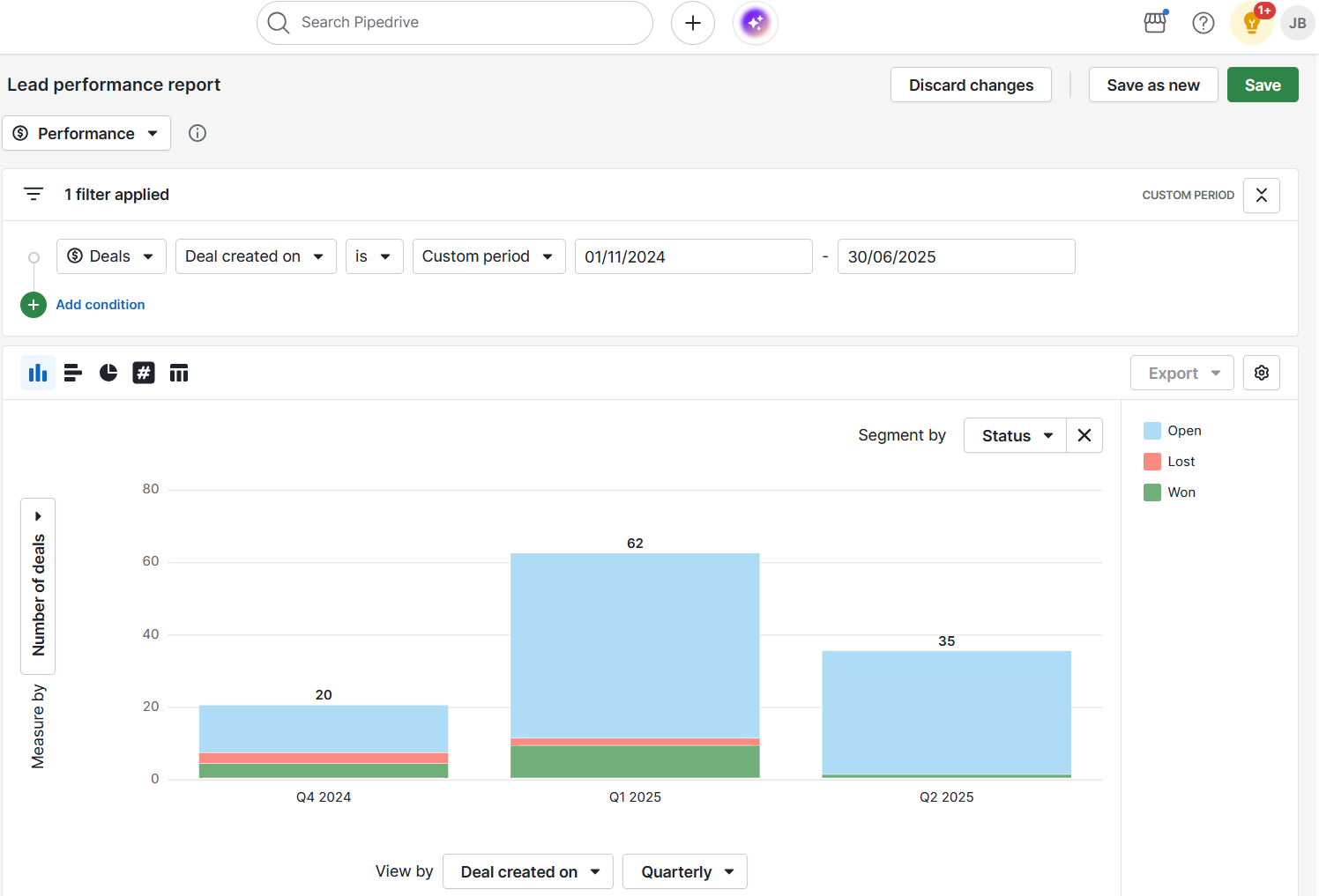
The sales figures will show you the total value or count of deals won, broken down by source.
Monitor your monthly quote progress in Pipedrive
Monthly quote progress shows you how you’re doing against your sales quota. It’s essential for staying on track and knowing how much more you need to close to hit your target.
To create this report, go to “Insights” > “+ Create” > “Report” > “Deals” and choose “Performance”.
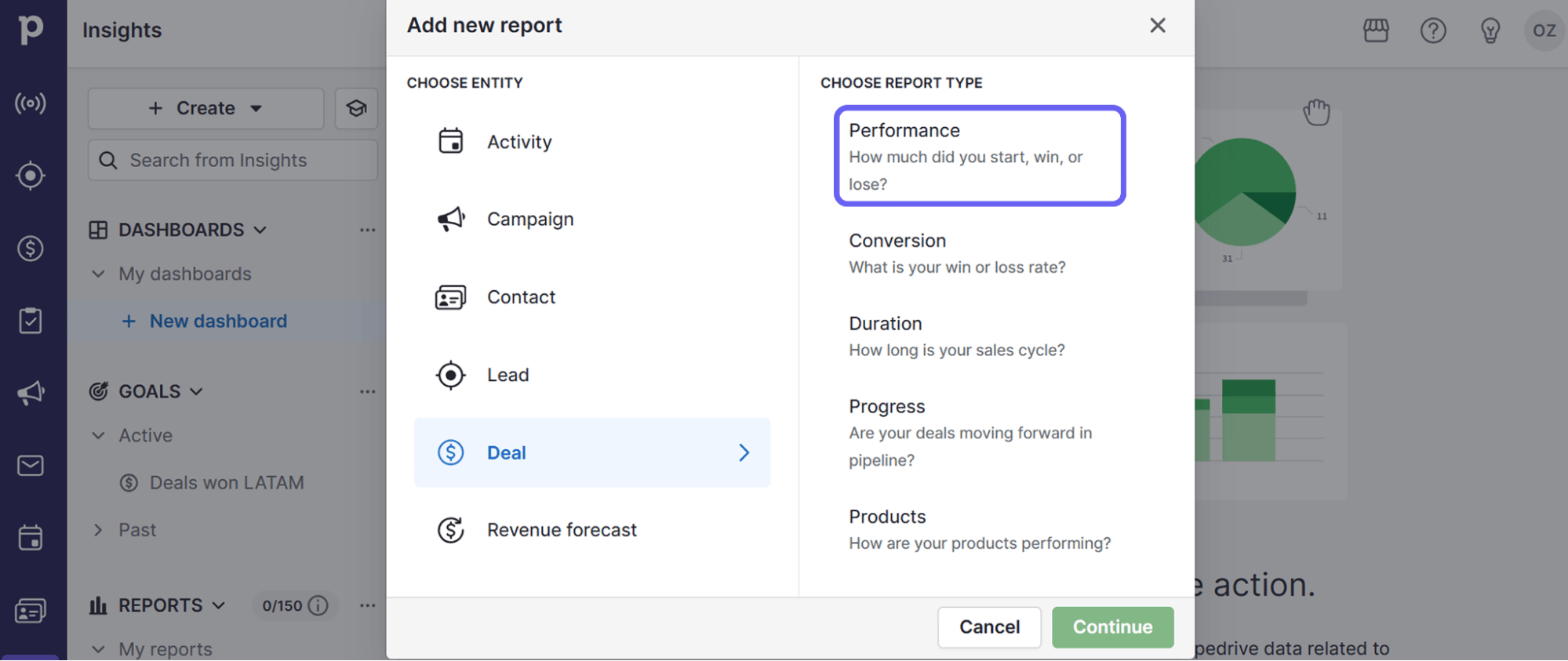
Use the filters to set the period to “Monthly” so you’ll only see sales deals closed within the current month.
Next, select “+ Create” > “Goal”.
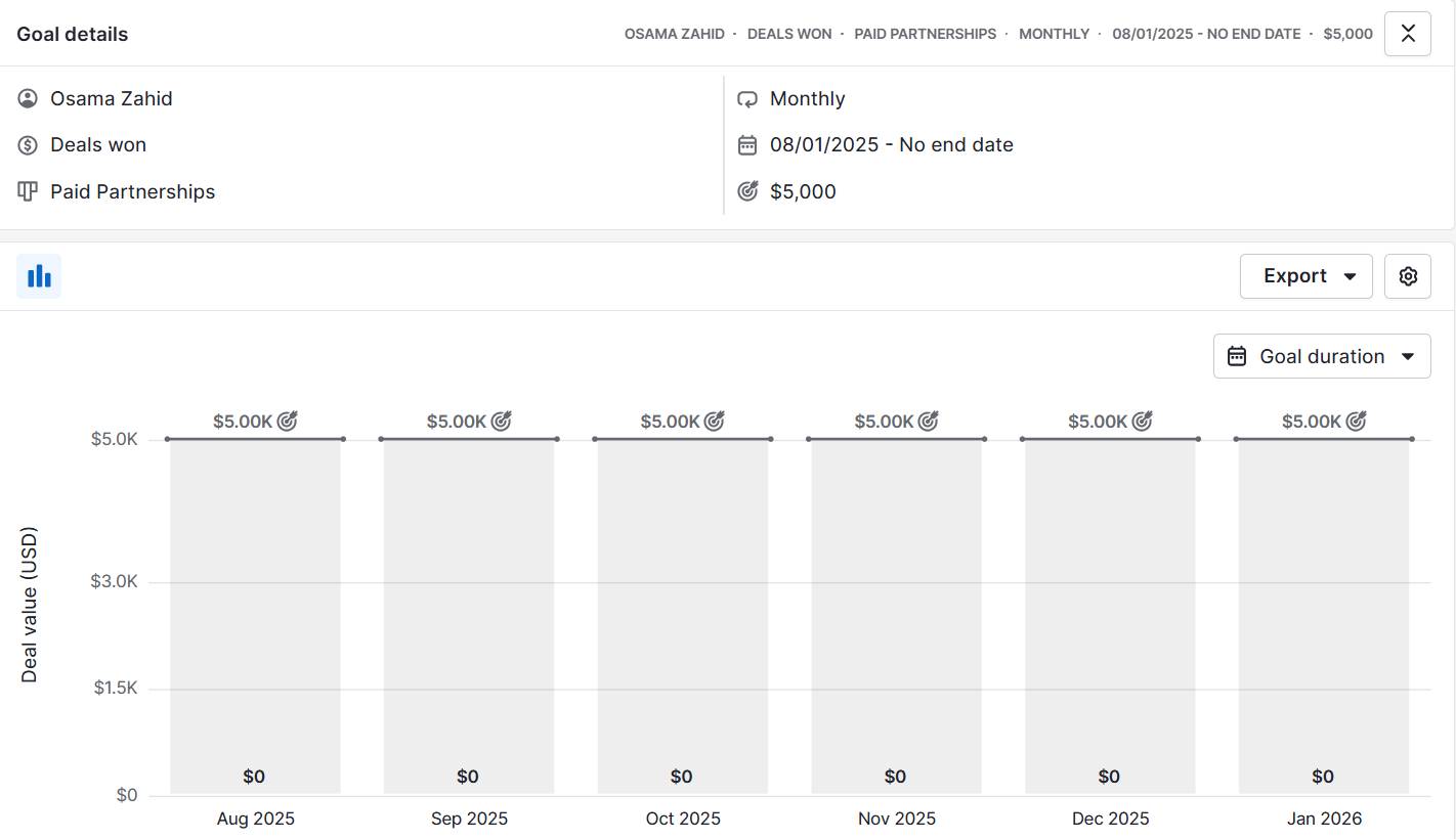
Set the “Goal type” as “Deal” > “Won”.
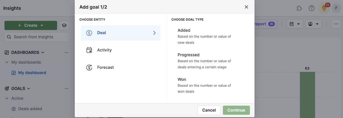
Enter your monthly quote in the “Goal value” field. When you view your “Deals won this month” report on your CRM dashboard, you’ll see your progress against the sales goal you set.
Link your activities to outcomes in Pipedrive
Effort doesn’t always equal results. That’s why linking your activity performance (like calls and emails) to outcomes (like deals won) is crucial.
When you do this in your sales charts, you’ll be able to see which activities are most effective at driving deals forward.
To track sales in Pipedrive, go to “Insights” > “+ Create” > “Report”. Choose “Activities performance” as the report type.
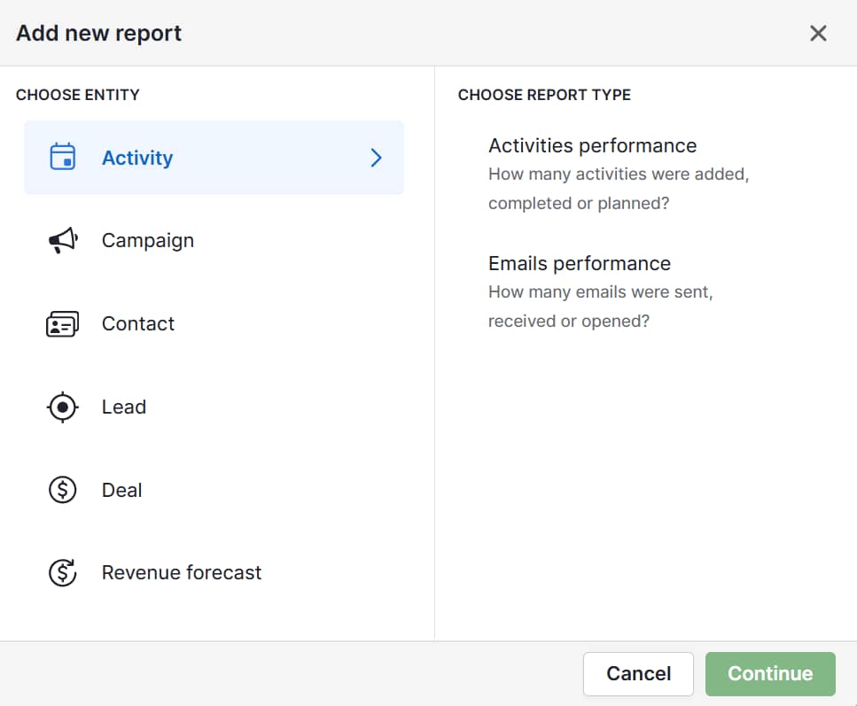
The report will show a chart showing how many activities you started and how many led to winning a deal. Use the filters to select specific activities (e.g., sales calls or meetings) to analyze.
You might find that, while you make hundreds of calls, the 20 sales meetings you book lead to 90% of your closed deals. You can then focus on securing more meetings.
Download Your Guide to Sales Performance Measurement
5 best practices for presenting sales graphs
In sales meetings, a graph can be a powerful tool that demonstrates your strategic thinking to your colleagues and managers.
With these best practices, you can turn your simple charts into compelling stories that highlight your insights and make your requests undeniable.
Here’s what to do:
Don’t just report numbers, show sales strategy. Your graph should explain why the data matters. Label your graph clearly so everyone understands what’s happening (and why). It’ll be clear that you know the factors driving sales success.
Focus on a single, powerful message. Powerful graphs make one clear point. Strip away any data that doesn’t support your main argument. To show that Product A is your top performer, compare it to your other products in a simple bar chart.
Translate data to high-level business decisions. Use your graph for future decision-making. Use data visualization to propose a strategic shift, like a new sales process, to show you’re a proactive problem-solver.
Design for clarity and avoid complexity. Avoid distracting effects and colors. Use a simple palette with one highlight color to draw attention to the main point. Add clear labels and titles. The easier it is to read, the more people can act on it.
Know your audience. A graph that impresses your sales manager might confuse executives. Show your audience that you know what information matters most to them.
The goal is to share information quickly, strategize and improve business outcomes.
The more you report sales results in infographics, the easier you find them. Experiment with interactive charts and designs until you find out what works best. With time, you’ll become a seasoned data analyst.
Final thoughts
Sales graphs turn complex data into clear insights that drive informed decisions. Whether you track revenue or team performance, the right visual helps you spot opportunities and problems faster.
Start with the metrics that matter most to your business right now. Create simple, focused graphs that answer specific questions about your sales performance.
With Pipedrive, you can track sales metrics and create visual reports that keep your team focused on what drives results. Start your 14-day free trial today and see how much clearer your total sales data becomes.


